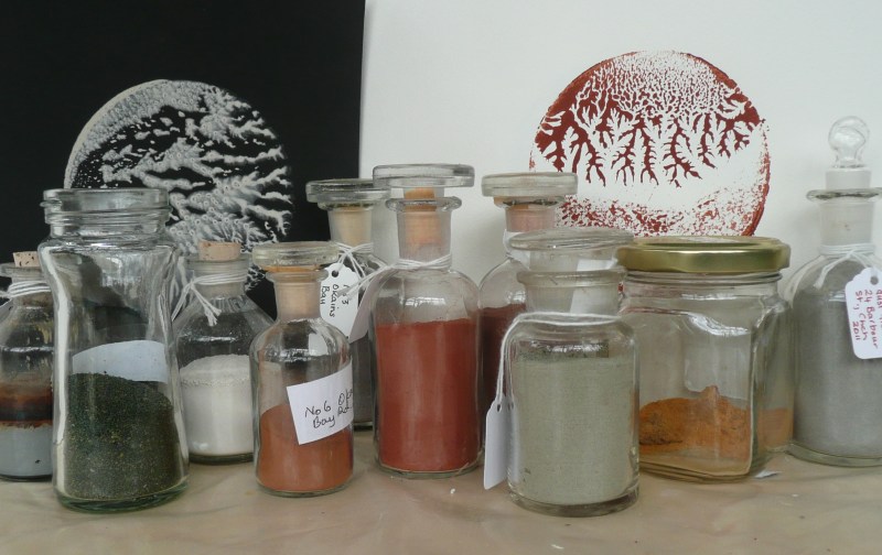
I usually put left over paint from my tests into wine bottle tops and attach a piece of paper to record the location, the date made and/or date collected and the colour. Here’s a selection that I pulled out the other day.

Earth pigments, paint, painting, printmaking, eco colour and visual arts; Canterbury, South Island, New Zealand

I tried to replace this image on the homepage, but was unable to….!!! Much too complicated for me. However, surprise, surprise, when I opened my site it had worked anyway. Ah, the wonders of the internet…
I have been making books, prints and other things…

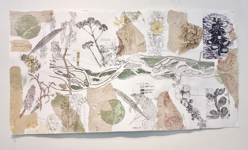
I took part in the show – Oxford Papermakers: Waiaraki Eyre River Project 4 – 28 November 2021
Alison Fleetwood, Katie Hallam, June Inch, Casey Macaulay, Elaine Steenhart, Tessa Warburton and Celia Wilson

More about this show can be found at the gallery website under ‘Exhibitions’:- https://oxfordgallery.org.nz/

Waikawa Bay is near Waitohi/Picton on Queen Charlotte Sound, and they are connected by a track through the Victoria Domain Park. There are other tracks in the Domain and you can walk to end of the peninsula; The Snout. We tried most of these three tracks and here are a couple of photos:

We were staying in Waikawa in February 2020, and these pigments I collected during the walks. These were three different clays and one harder rock (the red pigment). I am trying to catch up with testing these pigments. It made a relaxing task compared to working towards exhibitions!
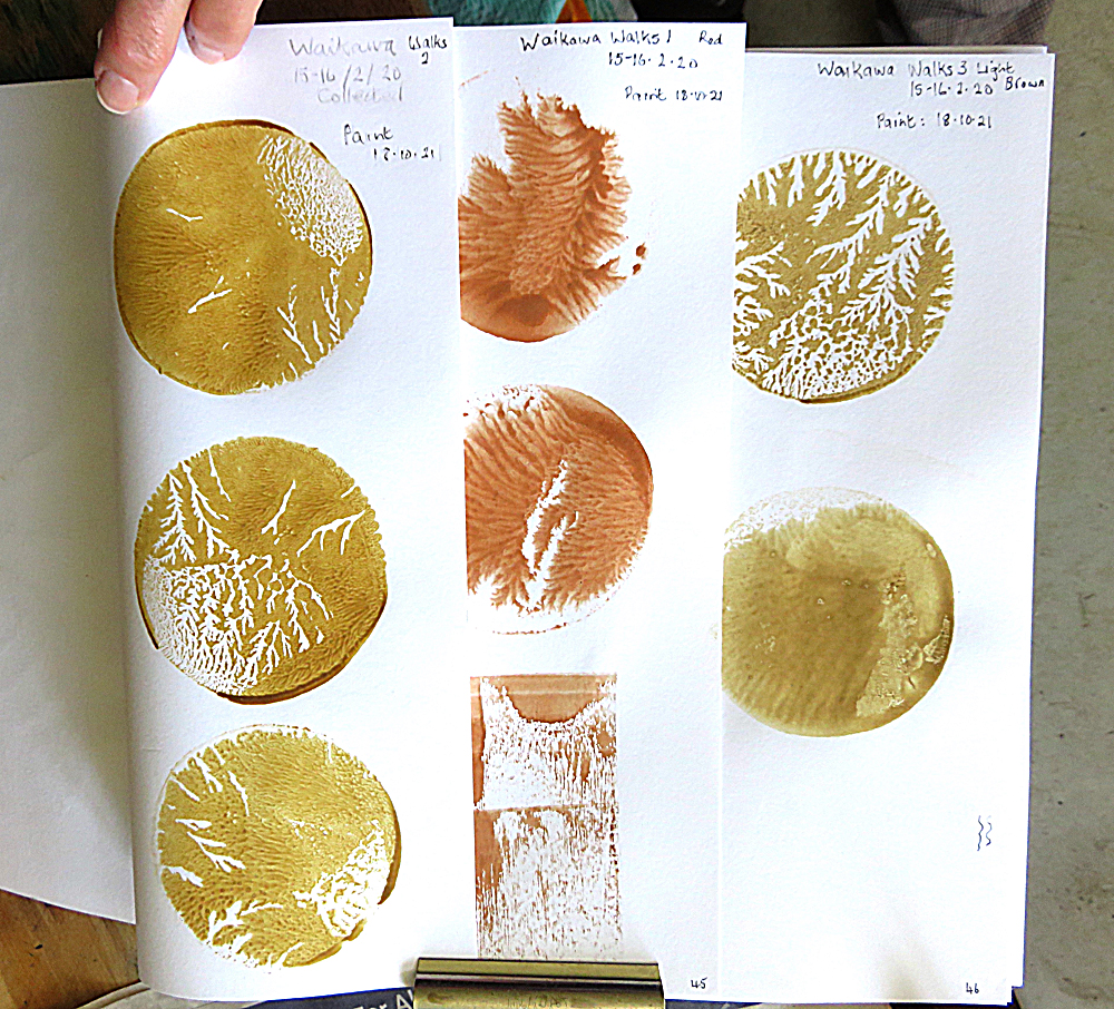
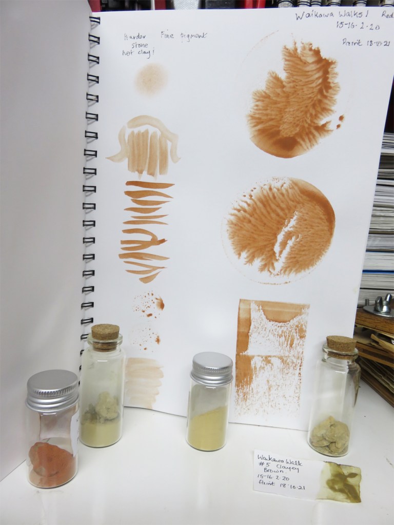
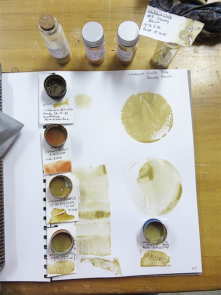
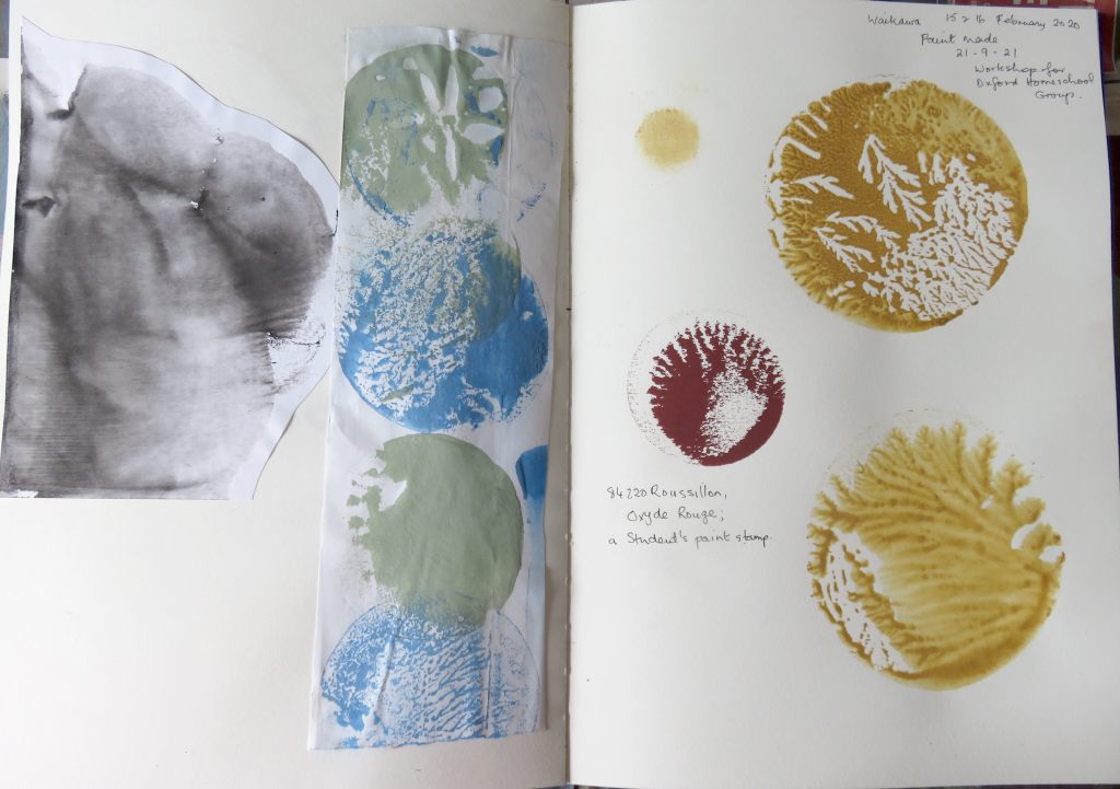
I rather like the #4 pigment, has an slight green colour to the brown. The sample “#5” in the photos above is the first paint I made at the workshop in September and is #4. Just to confuse us all. It is interesting how yellow pigments can give a variety of darker colours. After the last Workshop in September I posted images of some of the paints made. These paint tests are made with the full strength paint, so the colours are quite dark. I have watered down the red paint, and I also rub some of the pigment powder on to the test page, for the record.

We set up our new exhibition at the Oxford Gallery, on the 6th October. As you can see we have very different approaches to printmaking.
Kathy Anderson, Jo Ernsten, Casey Macaulay, Ruth Stanton-Mcleod, Kris Waldin, Tessa Warburton & Celia Wilson
7-24 October 2021


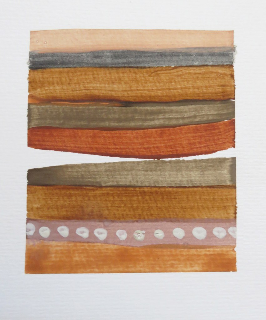
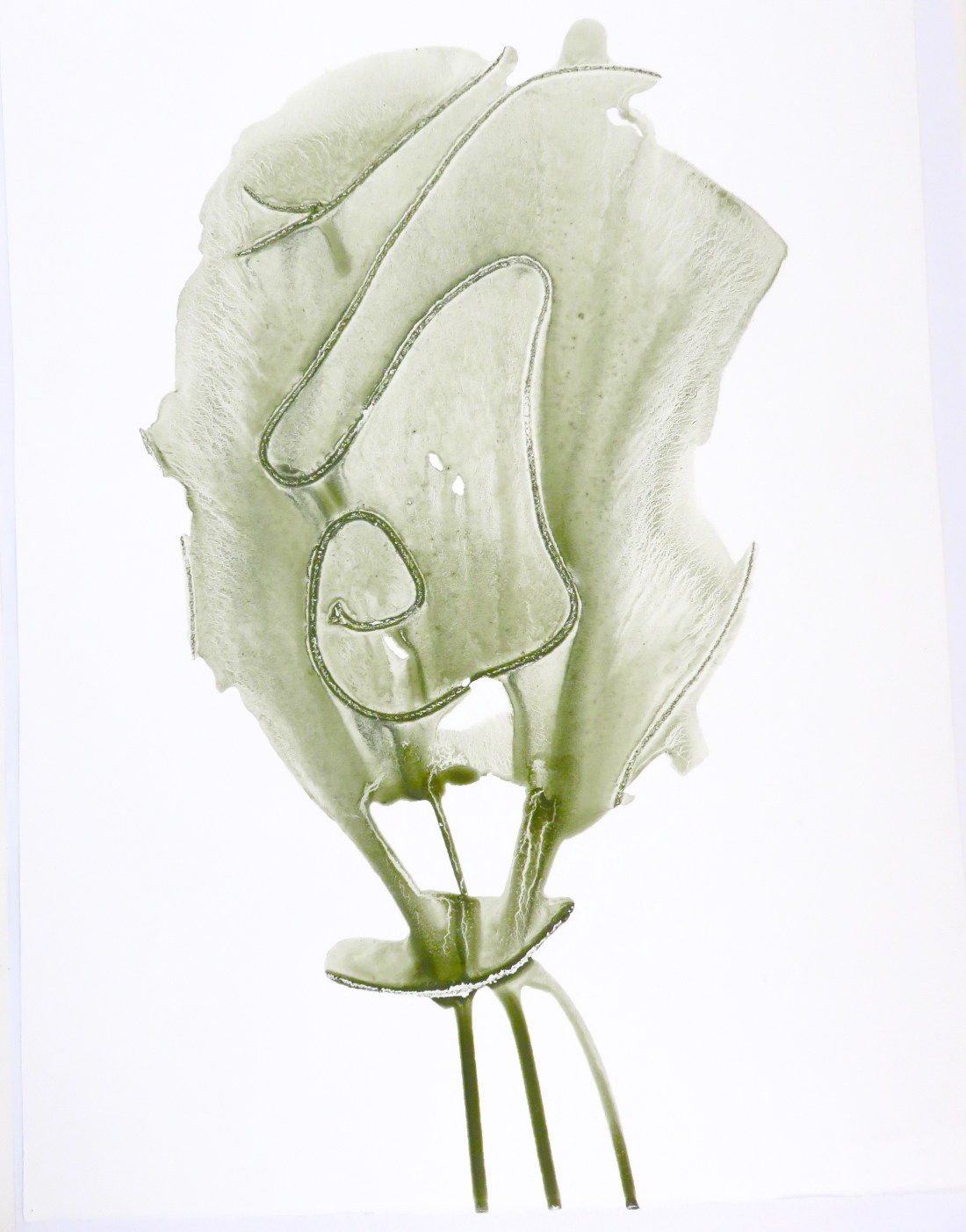
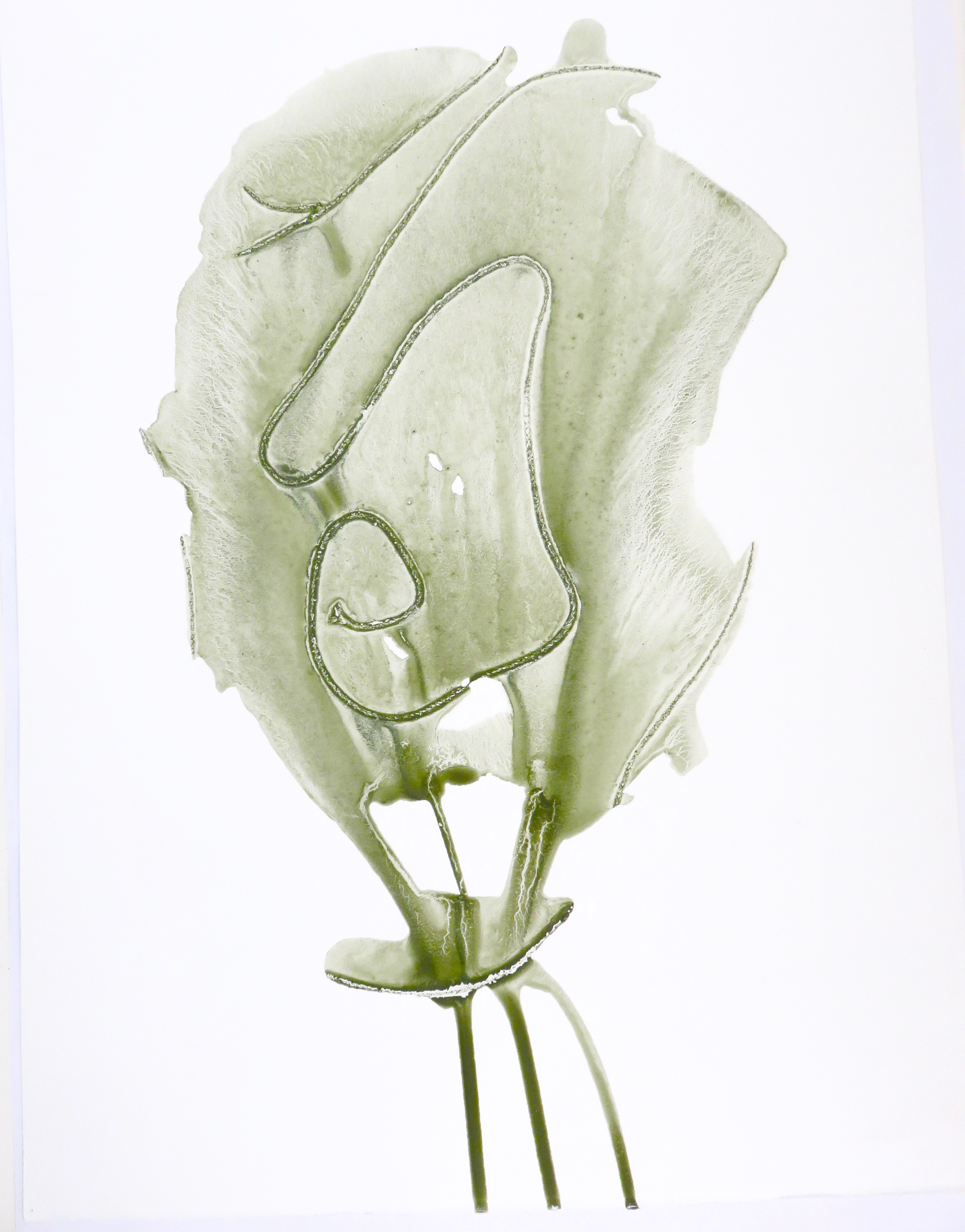
Here is my submission.
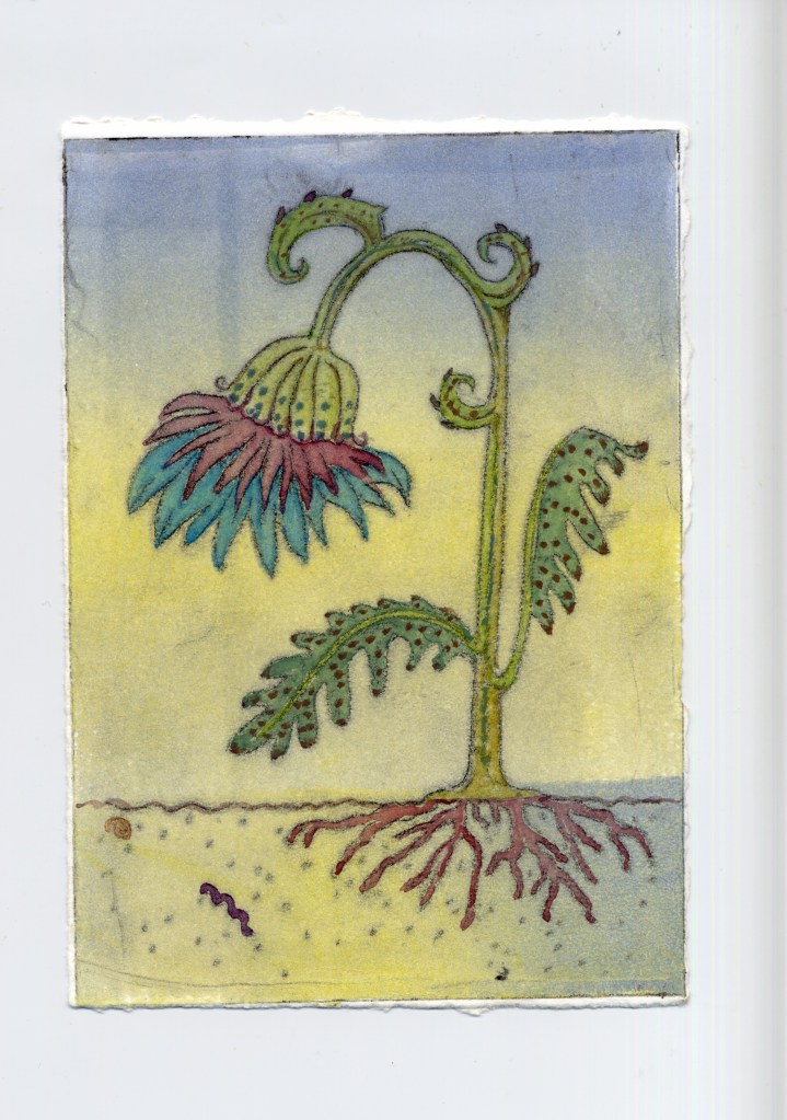
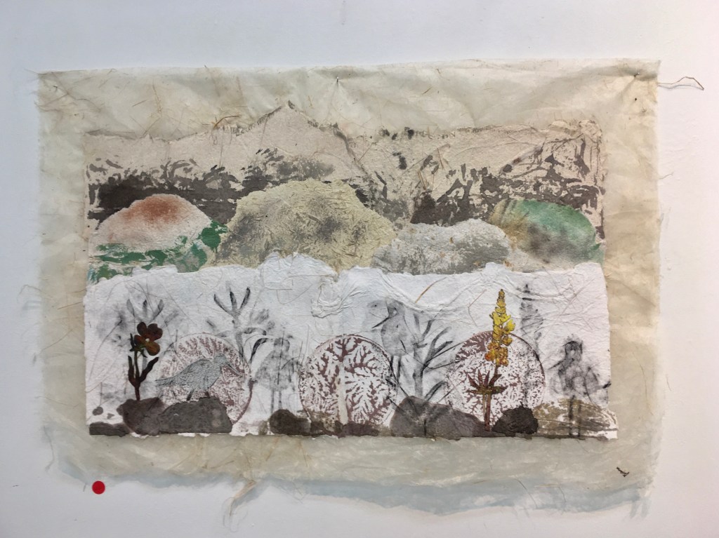
For this set of hand coloured prints I concentrated on the flora and fauna of the River Eyre/Waiaraki to show the displacement of bird life by introduced by exotic plant life. The plants take on an imaginary shape, though based on actual plants. These prints were influenced by medieval illustrations; I felt our present day understanding of nature is in some respect no different to their ideas of what exotic animals might look like. My work always comes out ‘pretty’ no matter how hard I try to make it the opposite! I really enjoyed painting these prints.


Ed 2/5 EV “Herbarium Exotica V” Celia Wilson
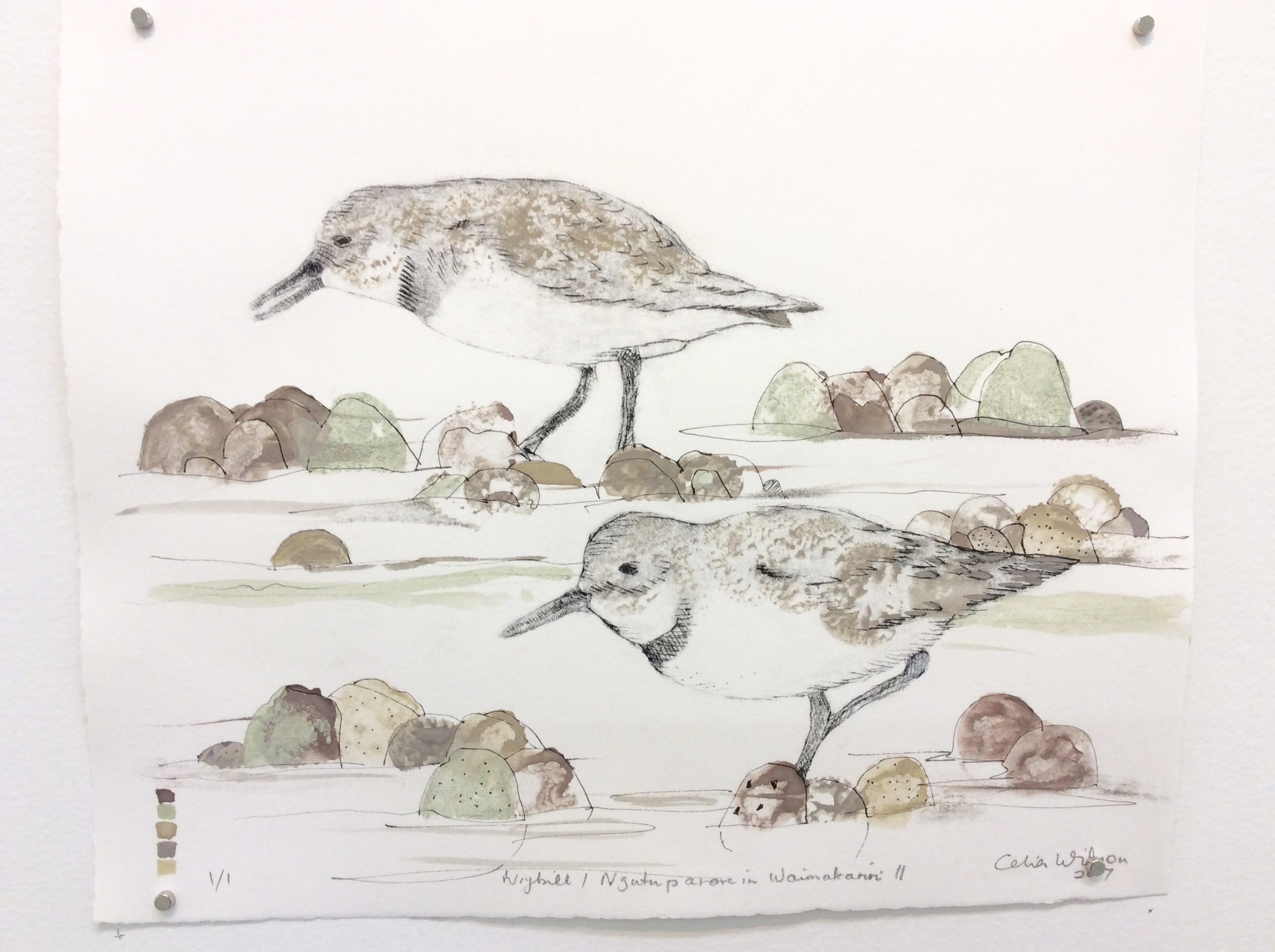
A Wrybill is the bird shown in this print.

My most recent workshop was held for a group of local school children.
They were very quick to understand the paint making process, and made lots of bottle tops of paint – on average four each.
I had not tested the Waikawa ochre pigment before, so I chose it for the paint making demonstration. I used watercolour medium of course, as that is my favourite binder. Another muller print to add to my collection.
The students used commercially ground natural pigments, as I do not have enough of my own hand ground pigments for a large group and, anyway, the fineness of these pigments makes it easier for the students to mix into the binder. We used pigments from Roussillon and Natural Earth and Mineral Pigments.
They really enjoyed painting with their own paints! Some of their paint is shown below.

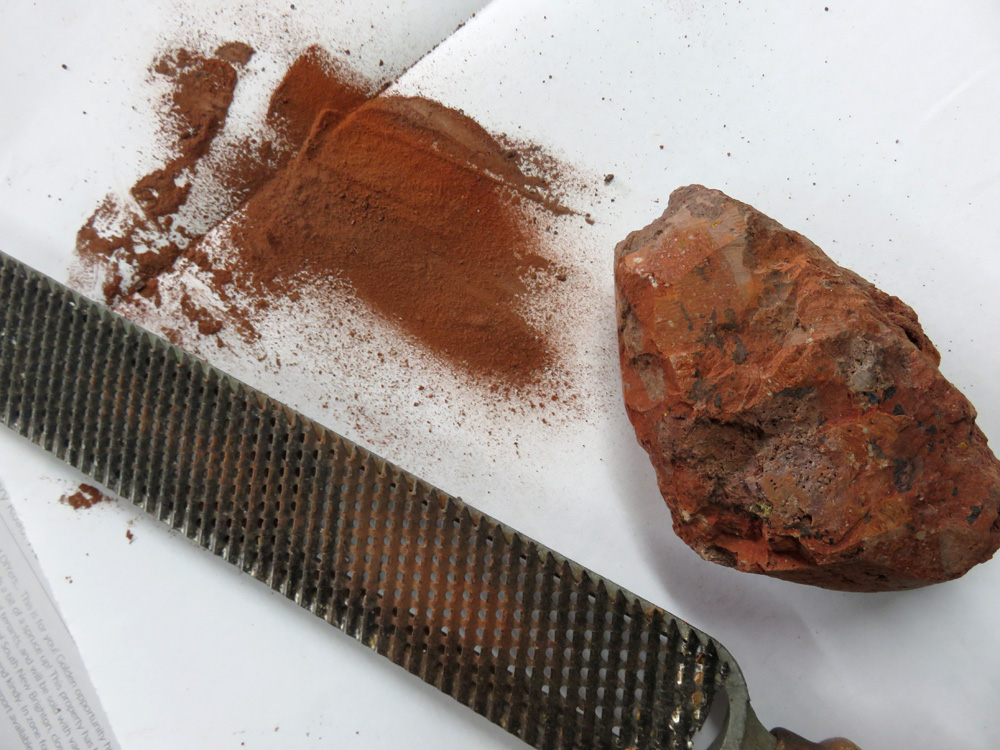
Not sure why I had not tried this method of making pigment before. The volcanic rock is mainly red but has a lot of other minerals in it, and as you can see the ground pigment varies in red-brown colours. The ground pigment fell through the file onto the paper. I made paint with the pigment you see here.

The lower left swatch of paint wet in wet shows how the different pigments can separate out. This is on 100gsm paper in my test book, so the cockling of the wet paper has enhanced the separation of the different pigments.
I had been reading up on middle stone age pigment manufacture which included tests of possible way of extracting the powder. The article discussed direct grinding on the grindstone and I wondered why I had not tried this before (even though I knew about this method). I don’t have a grindstone, so the file was substituted. This method will work well on this type of rock which is relatively soft compared with some of the water-shaped rocks of rivers I see. So on rocks similar to the one here, I will definitely use this in preference to my hammer!
‘Direct grinding is the most efficient method to extract fine powder from softer shales and siltstones.’
Rifkin, Riaan F. “Processing Ochre in the Middle Stone Age: Testing the Inference of Prehistoric Behaviours from Actualistically Derived Experimental Data.” Journal of Anthropological Archaeology 31.2 (2012): 174–195. Web.
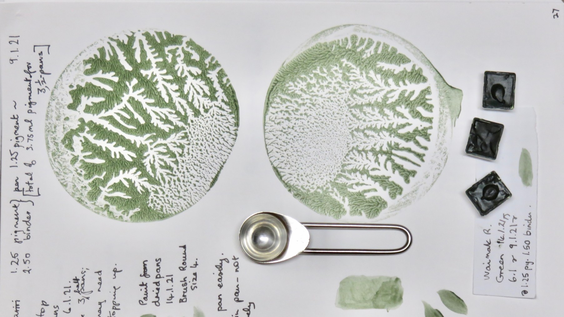
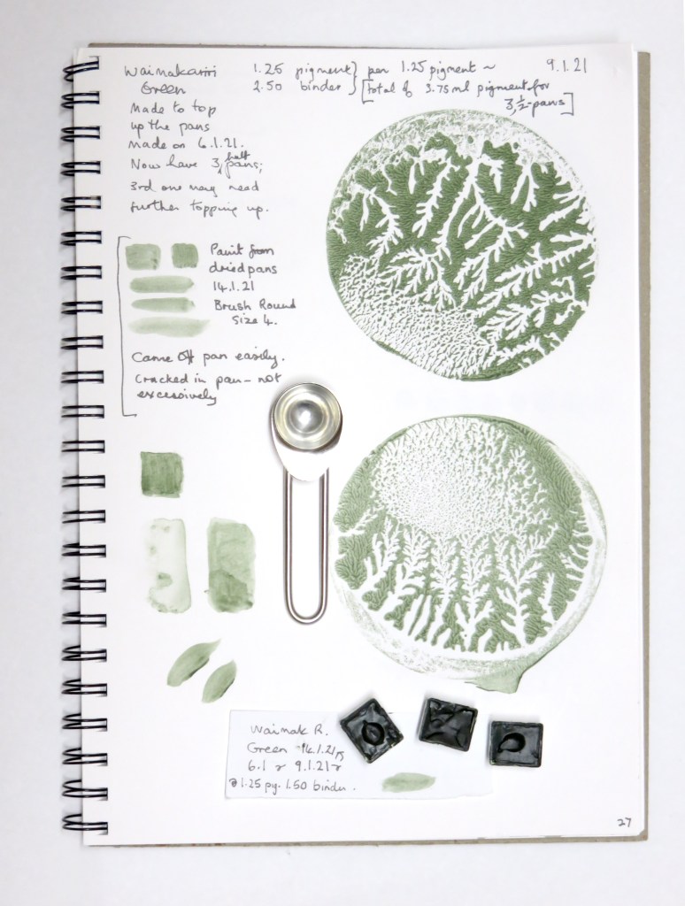
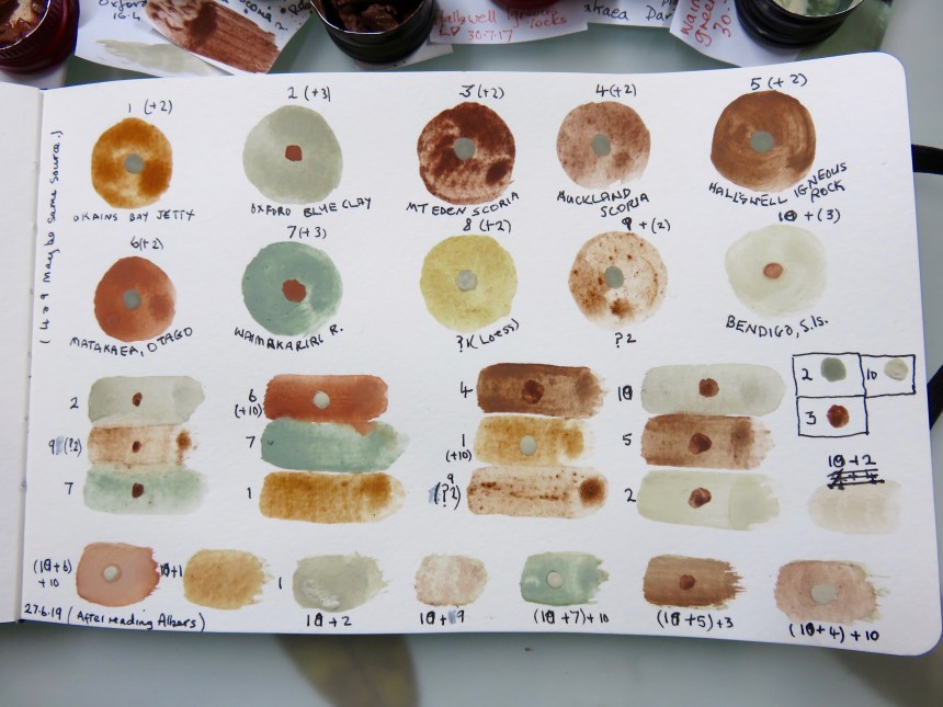
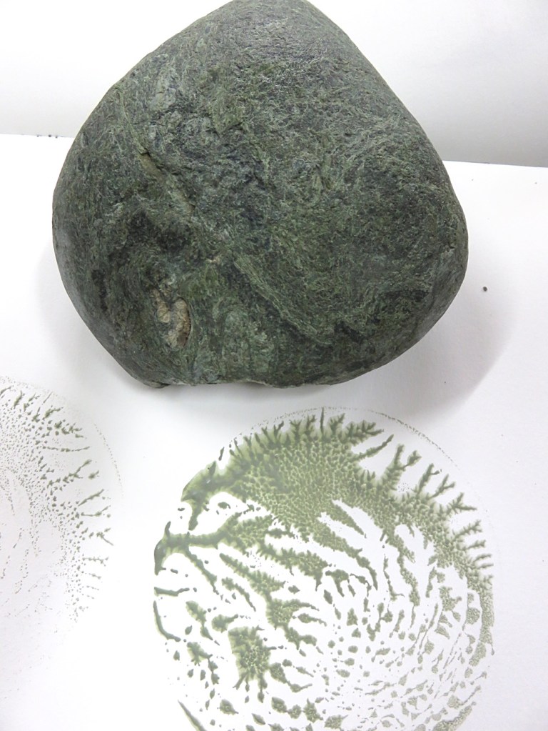
A page from one of my test books, showing this green sedimentary rock from the Waimakariri river. I make these tests every time a new paint is made. This in my ninth A4 book.
Welcome to my website, which shows the variety of art I have chosen to do, much of which is based on my use of local rock pigments and colours from plants.
This interest in pigments started when researching my subject – an eroding hillside, and I realised the colours revealed could be used to make paint. I followed my intuition at first, knowing the art of Richard Long who in the UK used Avon River mud on gallery walls. I crushed and heated the clay and mixed with water and even acrylic primal, and applied to paper and canvas. Eventually I was laying the clay over the studio wall. It was during the next years study that I investigated watercolour binders for the rock colours.
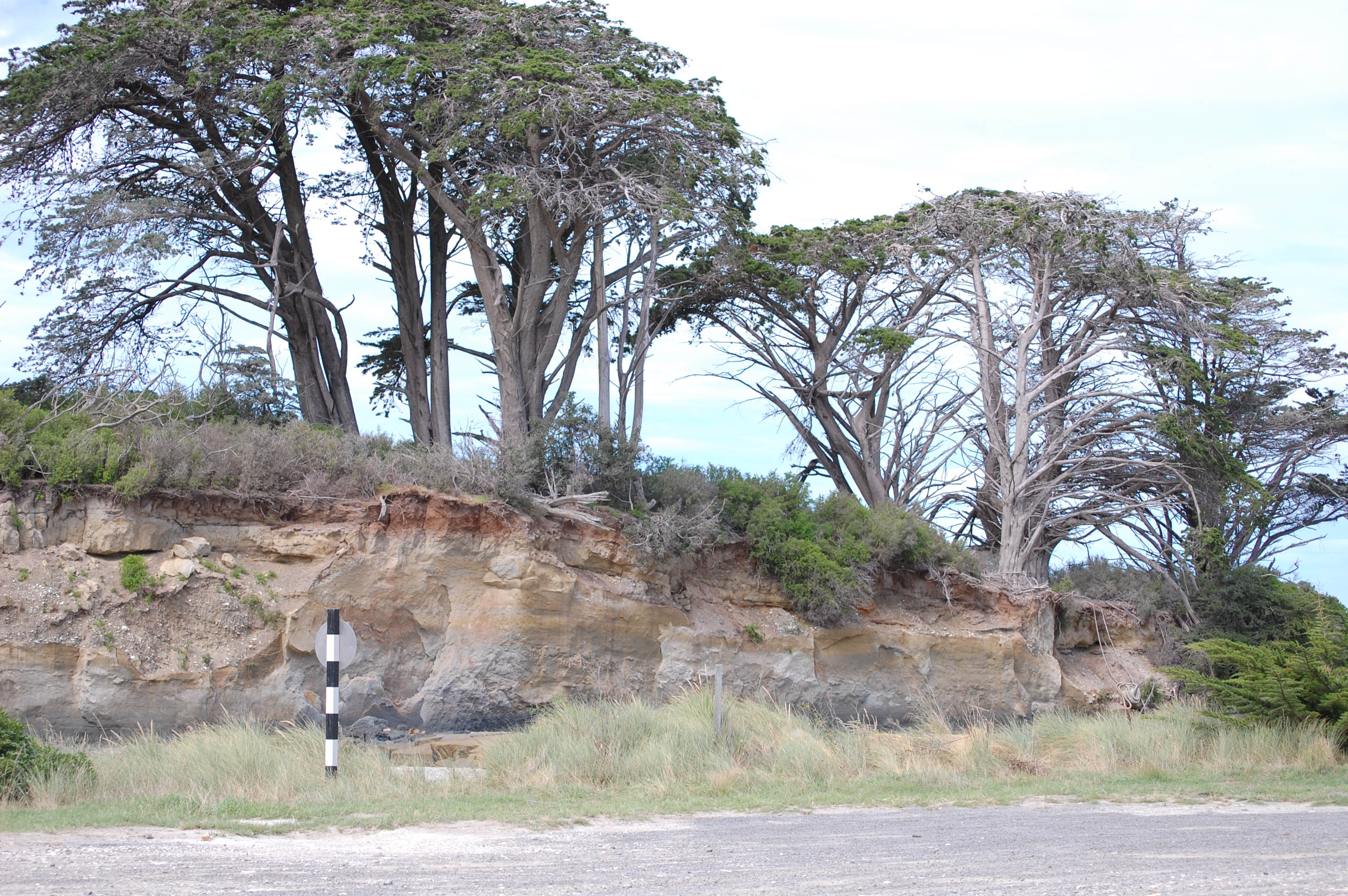
Having worked at setting up and running a certified organic orchard in Paparimu near Hunua, south of Auckland, sustainability and environmental concern played a big part in my choice to use local rock and plant pigments. While I find rock beside road cuttings and on rivers and beaches, I feel quite aware that this is not a never-ending resource. You only need a small pebble, size of a walnut shell, and a tablespoon of ground pigment to give a few years supply of watercolour paint. Even the binder ingredients can be sourced in New Zealand. I notice the rain transporting the coloured clays down to the rivers and the sea. Here in Canterbury, the rocks continually coming down the braided rivers are necessary to prevent the erosion of the land by the sea.

Volcanic clays, Banks Peninsula
Canterbury pigments provided me with a method of discovering more about the topography, landscape and history of an area that I had only previously known as a visitor.
Locally-found pigments obviously speak about place, however, what they show is not so immediately apparent to the casual observer. Most of the colours are underground and only revealed by the natural forces, erosion or when roadworks cut through the land’s surface.
While the artworks speak about place, they also demonstrate the distinctive qualities of these local pigments. Natural earth pigments, because they are unrefined, make a paint that is full of texture and colour variation which is unique to the place of origin. The colours within a rock emerge during the grinding process, yielding a colour that has a brilliance and a character all of its own.
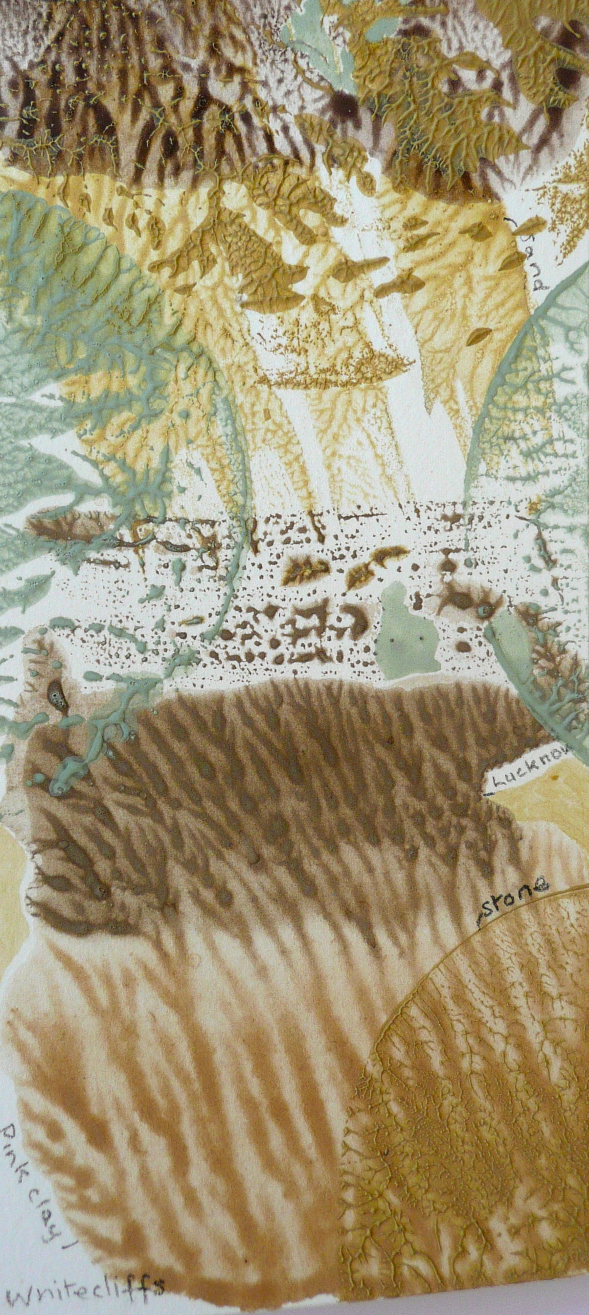
Above; Motunau rock layers
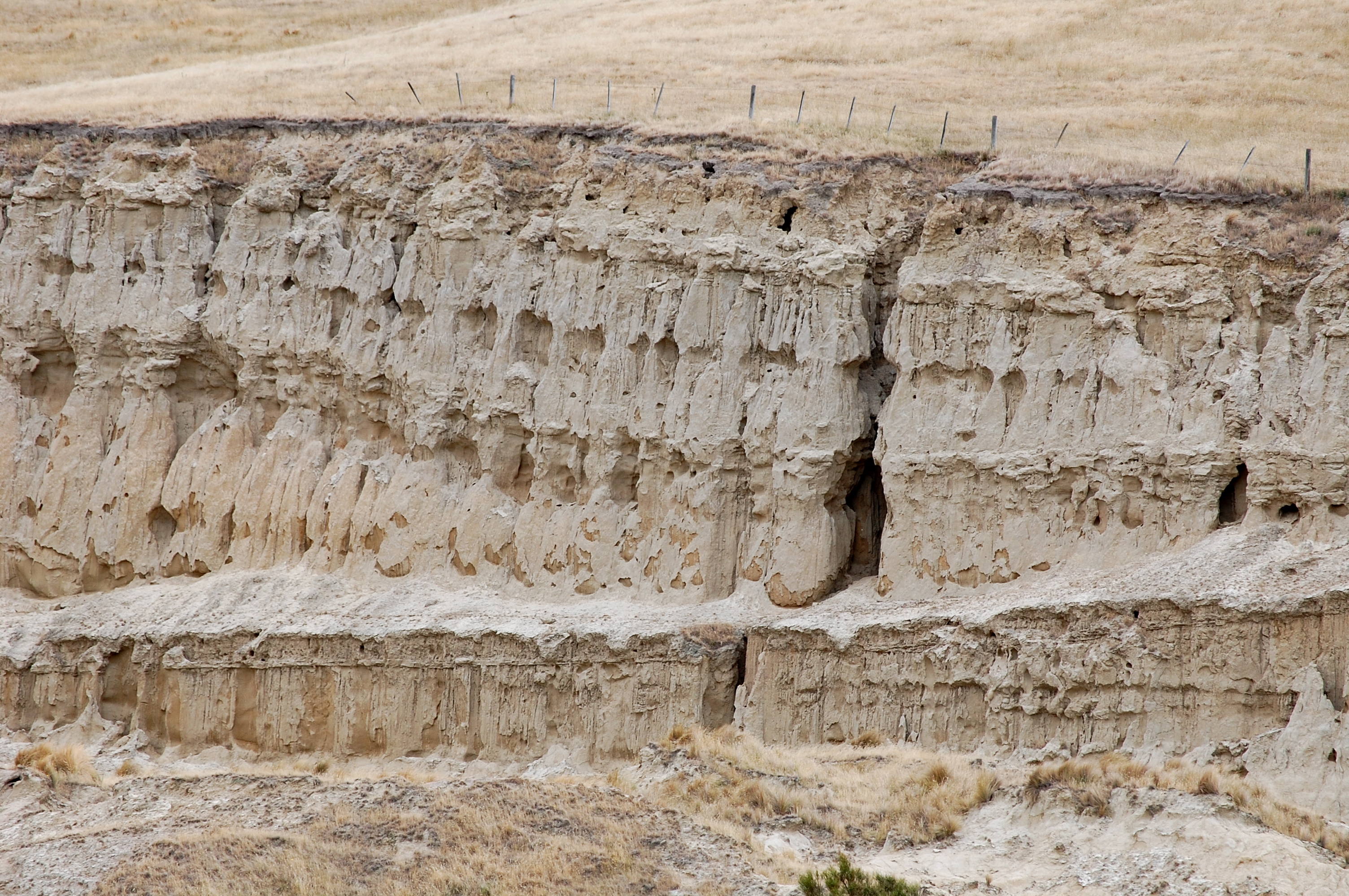
Below; Loess, shown here near Banks Peninsula. This is rock that covers the land, accumulating over the millennia, from windblown particles of rock dust. It can erode in fascinating ways.

In researching the topography and history of the Canterbury landscape, I was intrigued by the imagery suggested by lines imposed on land. This is shown concretely, as roads, railways, fence lines, shelter belts, drains, canals. It is shown abstractly as partition lines drawn up on a map and the blocks and grids denoting divisions or boundaries of town or country. This imagery became the basis for the development of my earth pigment paintings.
All images copyright © Celia Wilson 2009-2023,
all rights reserved; may not be reproduced without prior permission.
Selection of work including paintings, bookbinding, printmaking, paint tests.

Various local pigments, on paper, book cloth and a print.
Celia Wilson
Artist
Biography
2004 – 2007 Elam School of Fine Arts, The University of Auckland. Bachelor of Fine Arts
2008 School of Fine Arts, University of Canterbury. BFA Honours (Painting)
New Zealand citizen by descent, permanently living in New Zealand from 1986, after many years moving between the UK, Australia and New Zealand.
Since 2007 I have been researching the availability and the historical and current uses of earth, mineral and plant pigments in New Zealand, mainly those of Canterbury, Banks Peninsula, Hurunui, and Otago, with the cataloguing and recording of colours being the methodology. These colours I use through painting, printing, book binding, and papermaking with the intention of showing pigments as colours found at a location.
With my pigments I usually make watercolour paint with gum arabic and honey as the main binder ingredients. I also use colours obtained from plants – roots, leaves and flowers – from gardens in Oxford. I have experimented with sustainable colour via solar dyeing and the steam printing of plant colour on to paper (‘ecoprinting’).
I find the watercolour medium brings out the characteristics of the rock pigment particles – some are opaque, some are transparent – and, as the pigment is unrefined, there are often hidden colours which can be revealed as the particles diffuse and settle into place on the paper.
In hand-ground paint the larger and irregular particles, plus the additional minerals or chemical substances embedded at molecular level, have the effect of reflecting a wider part of the spectrum. It has been shown that this creates a more intense colour than a synthetic colour which reflects a narrower part of the spectrum. The use of natural plant dyes is an eco-friendly practice, the dyes are safe for body contact, while the colours are beautifully unsophisticated and harmonised with nature. The uniqueness of each batch of colour is also a characteristic I value.
My interest in nature stems from a curiosity of how land is formed, and how humanity has changed both the land and its biota. A practical involvement with the land in Paparimu, near Hunua, (since 1989) has included the design, establishment and running of a certified organic orchard for ten years until 2007. I am now living in Oxford, North Canterbury and volunteer at the Arts in Oxford Gallery helping with exhibition installation.
Selected exhibitions and workshops
2020 Christchurch City Art Gallery, Paint Making Workshop for Adults, 26 October
Open House, on Fridays/Saturdays/Sundays between 17 July to 13 September, Arts in Oxford Gallery. Seven printmakers working in the gallery’s main exhibition space to encourage and provide broader connections between artists/creatives and communities. This to be achieved by inviting visitors to view and discuss works in progress with the artists, watch demonstrations of techniques, and inviting other artists to attend and join-in on a casual basis. Printmakers are Kathy Anderson, Jo Ernsten, Casey Macaulay, Ruth Stanton McLeod, Kris Waldin, Tessa Warburton, Celia Wilson.
2019 Canterbury Colours Workshops for Adults and Children, Turanga, Christchurch City Library, 13 January
Oxford Papermaking Group, showcase exhibition of handmade paper and how it can be used, 27 July to 11 August, Arts in Oxford Gallery.
2018 Locality, group exhibition exploring location, materiality & positioning with Mark Adams, Tony Bond, Mike Boot, Cheryl Lucas, Elfi Spiewack and Tessa Warburton. 9 June – 10 July, Arts in Oxford.
Paintmaking Workshop, 23 June, Arts in Oxford Gallery.
2017 From the Rivers to the Shore, 10 June – 18 July, group exhibition curated by Celia Walker, Arts in Oxford Gallery.
#TheFlockWorkshops, in connection with BRaid, 30 May – 16 June.
Sanctuary, group exhibition for Artists Against Slavery, Arts in Oxford Gallery, 28 October – 29 November.
2016 Accumulative, group show with Ruth Killoran, Ruth McLeod, Rachel McRobb and Kris Waldin, Arts in Oxford Gallery, 8 October – 2 November.
Paintmaking Workshop, 23 October, Arts in Oxford Gallery.
2015 Kidsfest, Artists Book Cover and Bookmaking Workshop with Tessa Warburton on 15 and 16 July, Arts In Oxford Gallery.
Hot Off the Press, group printmaking exhibition with Gaby Reade, Heather Maxwell, Ruth Stanton McLeod and Sue Alexander, July/August, Arts in Oxford Gallery.
Paintmaking Workshop, 1 November, 2015, Arts in Oxford Gallery.
2014 Kidsfest, 5 – 23 July, 2014. Paint making Workshop on 15 July. Arts in Oxford Gallery.
2013 Colours from a Landscape. Solo exhibition. Dunedin Botanic Gardens, in association with The Blue Oyster Gallery, Dunedin.
2012 Colour of Distance. Group exhibition with Helga Goran, Kim Lowe, Jocelyn Mills and Cristina Silaghi. Papakura Art Gallery. 3 March to 7 April, 2012.
Sense of Place. Group exhibition with Helga Goran, Kim Lowe and Cristina Silaghi. Hastings City Art Gallery. 28 July to 9 September, 2012.
Land | Scape. Group exhibition curated by Tracey Williams. Papakura Art Gallery.
2010 Colours from the Earth. Solo exhibition. The Chamber Gallery, Rangiora, 2 May to 2 June.
Forms of Attention. Group exhibition with Helga Goran, Kim Lowe and Cristina Silaghi. The Arts in
Oxford Gallery, Oxford. 24 October to 21 November, 2010.
2008 Postgraduate Conference, 10 October, 2008, School of Fine Arts, University of Canterbury.
Presented Out of the Ground, a talk on my use of Canterbury pigments and their place in my artworks.
Publications
“Studio Work”, Oculus, Postgraduate Journal for Visual Arts Research, University of Canterbury Department of Art History and Theory, 1, (2009): 56-57.
Forms of Attention. Catalogue to accompany exhibition at Arts in Oxford Gallery, 2010.
Colour of Distance. Catalogue to accompany exhibition at Papakura Art Gallery, 2012.
Experiencing Distance: Creative Explorations. Contribution to educational supplement to exhibition Papakura Art Gallery, 2012.
Sense of Place: Distances: Passages, Conjunctions. Catalogue to accompany exhibition at Hastings City Art Gallery, 2012.
Fragile Paths, Proximities and Distancesin “Dwelling and Sharing: Places in Experience”. Educational supplement to Sense of Placeexhibition Hastings City Art Gallery, 2012.
Tessa Laird, From the I-Land.Publication to accompany the group exhibition LAND| SCAPE, Papakura Art Gallery, curated by Tracey Williams, 2012.
“Canterbury Colours”, Turkey Red Journal, Vol 22, Issue 2, Spring 2018
Collections
The James Wallace Arts Trust <www.wallaceartstrust.org.nz>
Private collections in the United Kingdom, New Zealand and China.

I usually put left over paint from my tests into wine bottle tops and attach a piece of paper to record the location, the date made and/or date collected and the colour. Here’s a selection that I pulled out the other day.
My (current) interest circles around the earth and organic pigments of the North Canterbury region of the South Island of New Zealand.


Copyright © Celia Wilson 2021. All rights reserved, may not be reproduced without prior permission except for reference or educational use.
Visit the gallery’s website for more information.
https://oxfordgallery.org.nz/activities/:
Concurrently I am also taking part in an exhibition ‘Pigment Pottery Paint’ with June Inch which finishes on 1 September. See – https://oxfordgallery.org.nz/exhibitions/
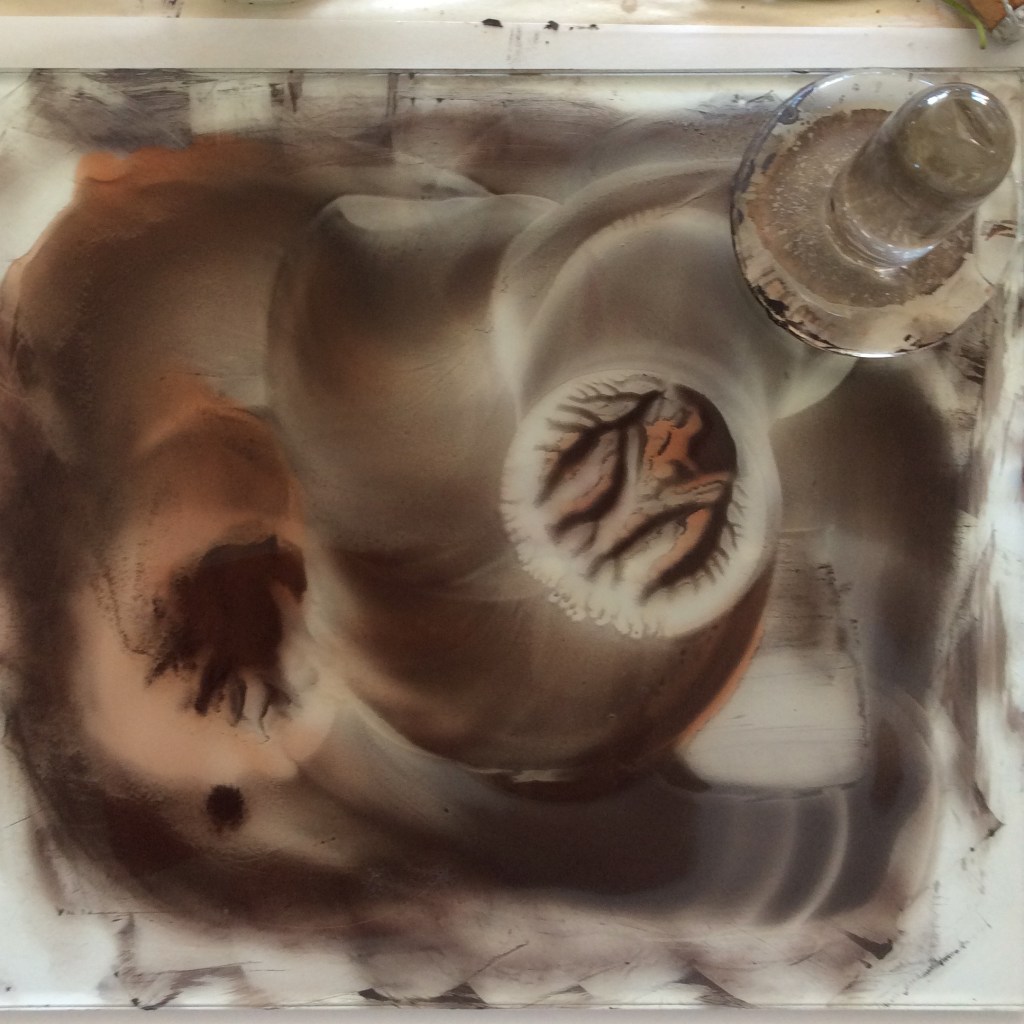
Here is an amazing pigment – black with undertones of red: it is being mixed into the binder with a muller.
Mixed media experiments
Using different colour palettes with various media.

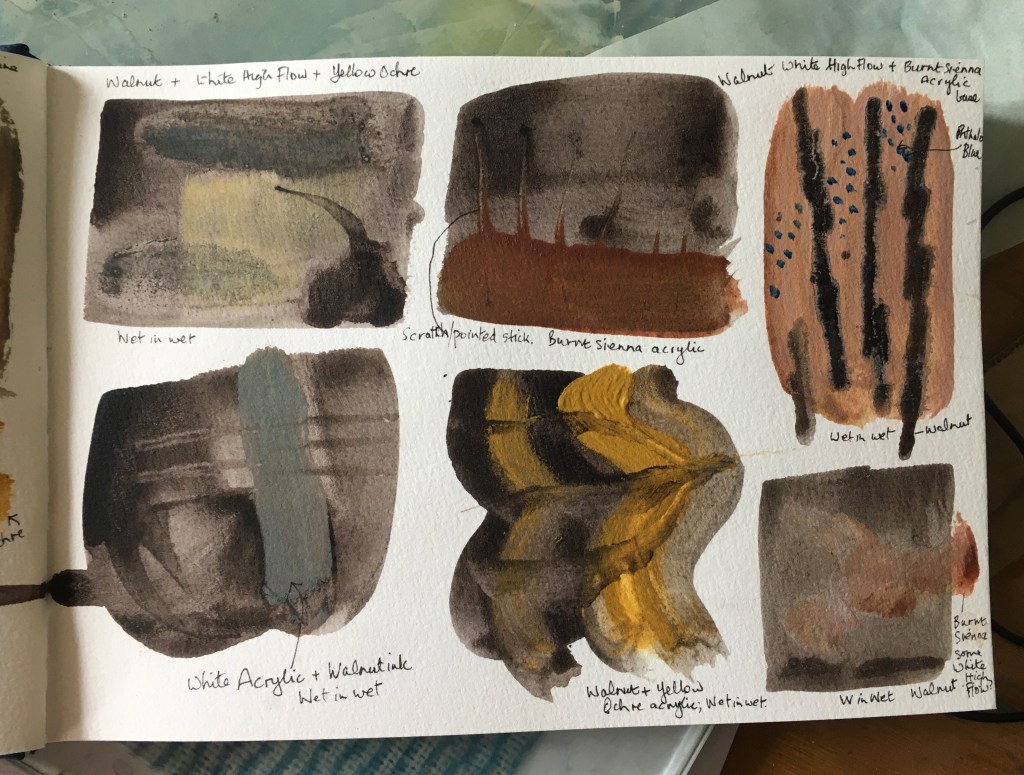
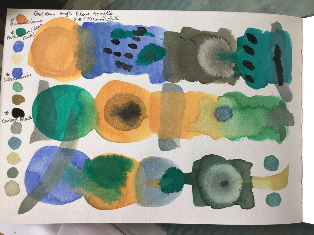
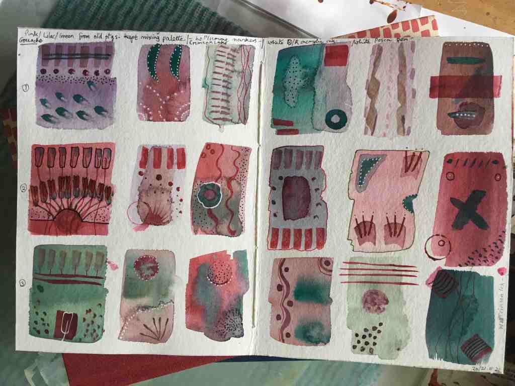

Watercolour and acrylics.
Could go on experimenting for most of the time! It’s the process, not the result that’s the thing.
While not much appearing on this blog for a while, I have none the less been very busy. It’s either Housework and no art, or Art and no housework! I have had a few surges of paint making, and been learning about gouache paint, done some eco prints on paper with autumn leaves etc, made quite a few books.
As a member of the paper making group at the local art gallery, we have been busy making paper with vegetation from the local braided river, Waiaraki/Eyre. Every month we make pulp and paper from a different invasive weed – fennel, spurrey, viper’s bugloss, evening primrose, mullein and yarrow. As the seasons unfold we manage to get quite a collection of different colours and weights of paper.
I just love walking the rivers, but it’s a great pity that the wild life, especially the birds, are under great pressure from the thoughtless and dangerous incursions of some people, on foot with dogs, or in vehicles. The rivers are used as rubbish and garden waste dumping grounds.
This rock will be going back to the river… Many thanks to my friend June who gave it to me.

Catching up a little, I seem to have neglected my website…
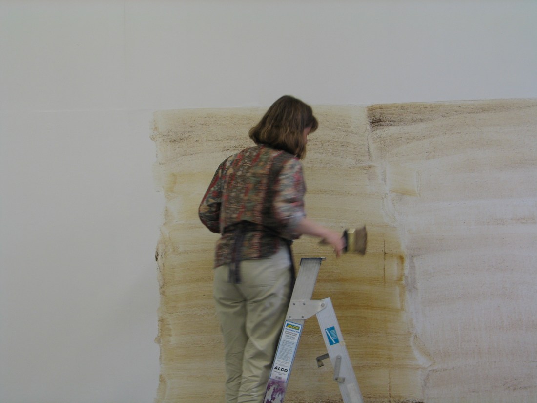
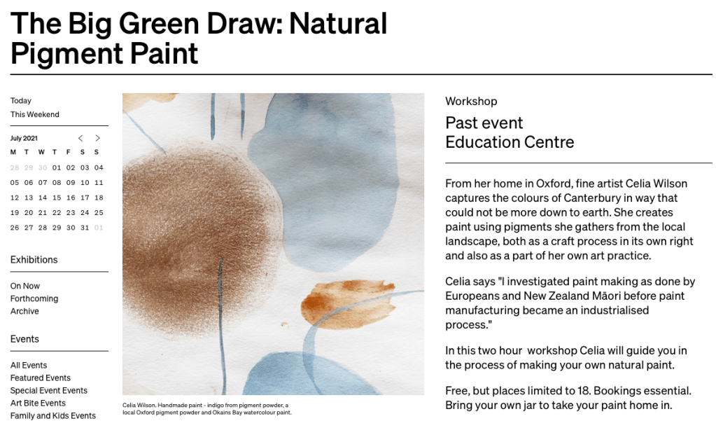
I was very pleased to be able to hold a paint making workshop at Christchurch’s art gallery on 26 October 2020. It was very enjoyable and the eighteen attendees made lots of paint to take home. Unfortunately I took no photos of this workshop (too busy to remember!) but, for the record, here is the announcement by the Christchurch Art Gallery from their website. However, below is one of the test sheets of paint that I made during the workshop.

Makers’ Day at Arts in Oxford Gallery
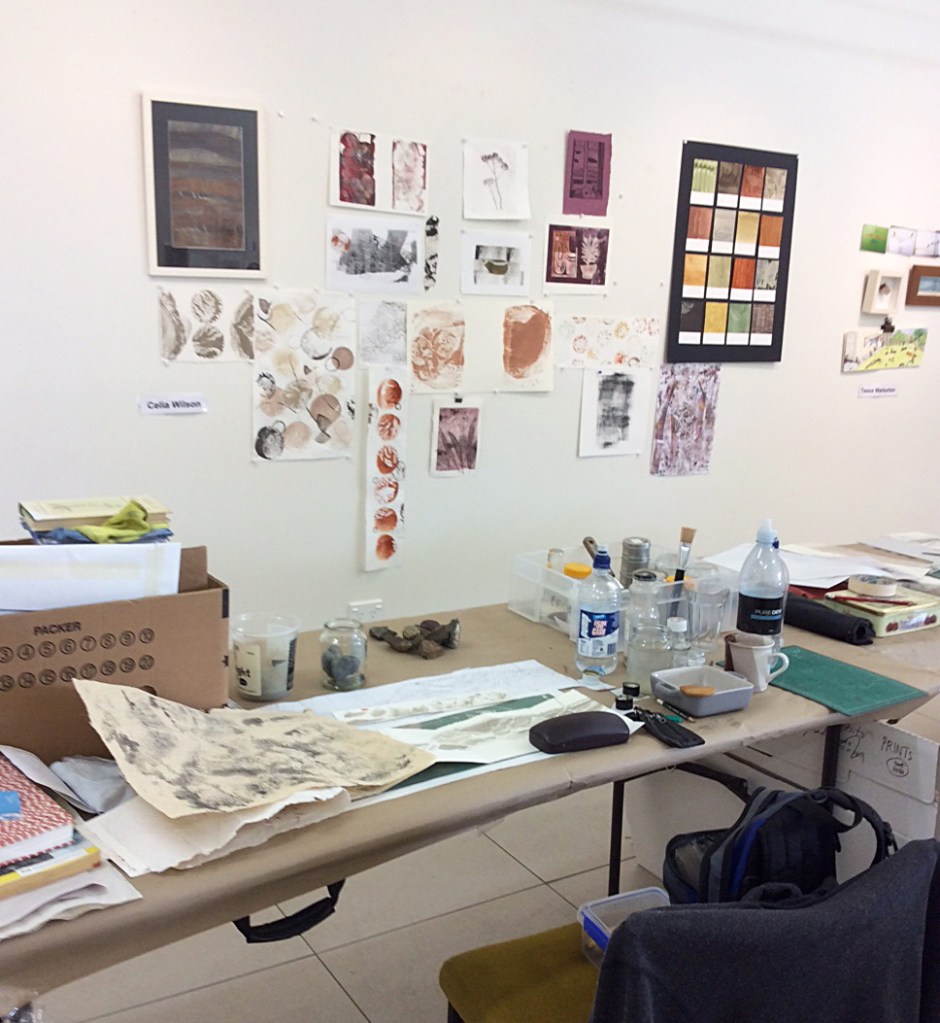
After “Open House”, at Arts in Oxford Gallery, we had a Makers’ Day on Sunday 27 September, 2020. There was a wide choice: Areta – Stone Tools; Jo – Printmaking; Celia – Pigment paint; Charlotte – Painting; Bret – Spatial Design; Young-Oak and Team – Spinners and Weavers; Katie – Collage; Casey, June, Alison, Tessa – Papermaking; Lynley – Stained Glass.
As you can see from the photo, Philip Trusttum’s exhibition “What have we got here?” was current at the time, and he was at the gallery that day. Here, at the start of Makers’ Day, he is in conversation with me about the muller paint prints in one of my record books.

Photo credit: Arts in Oxford Gallery
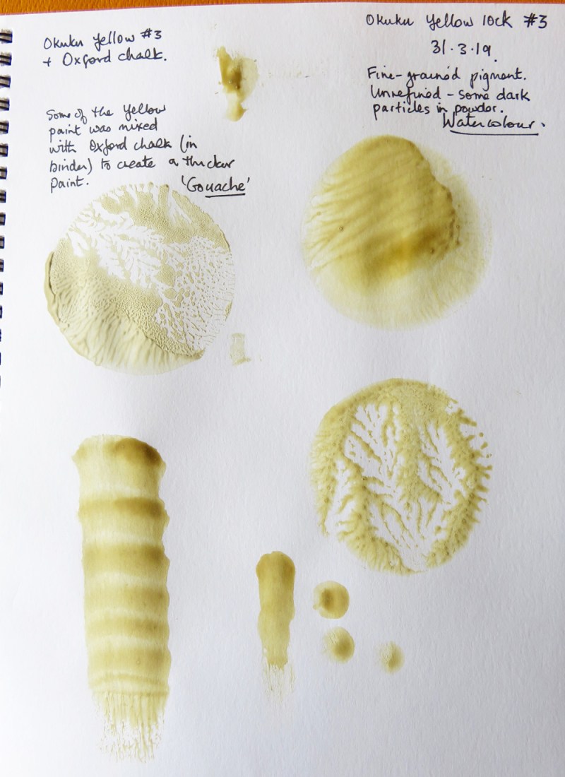
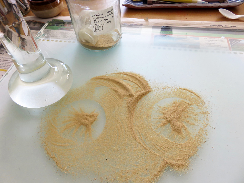
I found this pigment at Okuku Saddle, situated north of Oxford, in the Lees Valley.

This was a chunk of loess from beside the road and above is the watercolour and gouache paint made from this pigment. The colour of the paint is reasonably true – varying from light tan when thick, to yellow when diluted with more water. The circular shapes are created by pressing the muller on to the paper and the patterns form as the muller is lifted. The top right impression was made with a wetter paint than the impression just below. The paint is reasonably opaque when thickly applied; and the chalk gives a lovely pastel colour. I made this paint again (pigment collected in 2009) as part of research for an artists book I have planned.

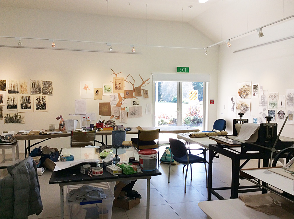
Open House is a great experience. We are in the final few weeks of the artist in residence project (on Fridays, Saturdays, and Sundays) . We think we have spoken to the public for about 60% of the time we have been in the gallery working. Its has been very satisfying to talk to visitors and to realise how many people out there are actually very curious about how printmakers make images, how we research and experiment. We have all enjoyed being artists together, a great opportunity to exchange ideas and learn in good company. Just such a great idea; we have been very honoured be invited and very pleased to take part.

Fellow invited artists with Jo Ernsten are Kathy Anderson, Casey Macaulay, Ruth Stanton McLeod, Kris Waldin, Tessa Warburton. Last weekend visitors were offered the opportunity to print and take home a calico carry bag. We have made some more which are now on sale in the gallery.
Here are some photos I have taken of some work made to date. First up is an image of my table and some old and new work on the wall.
I have been using rock pigments from the Eyre/Waiaraki River that runs by Oxford. Water only runs through the braided river bed after rain, and the close-by headwaters are in and around the Mt Oxford hills. Weeds can grow and make the shingle beds unsuitable for nesting birds, but there is still lots to see at any time of the year. We have collected some of the weeds to make paper at the Gallery, and I am using some of this paper in my Open House art. I’ve been making *muller imprints with the paint I’ve made – browns, reds and greys. I have included paint made from green Waimakariri River rock as well – that river is not far from Oxford, and the Eyre/Waiaraki River eventually joins the Waimakariri closer to the coast. The Eyre/Waiaraki River used to end in swampy ground situated to the north of the point where it is now diverted into the Waimakariri.
From various maps I have drawn a section of the braided river in Oxford, made dry-point prints of the river bed structure (always moving!) and a selection of introduced weeds as well as New Zealand native plants that are found around and in the river bed.
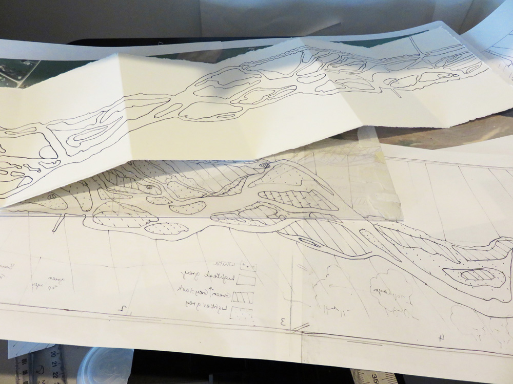
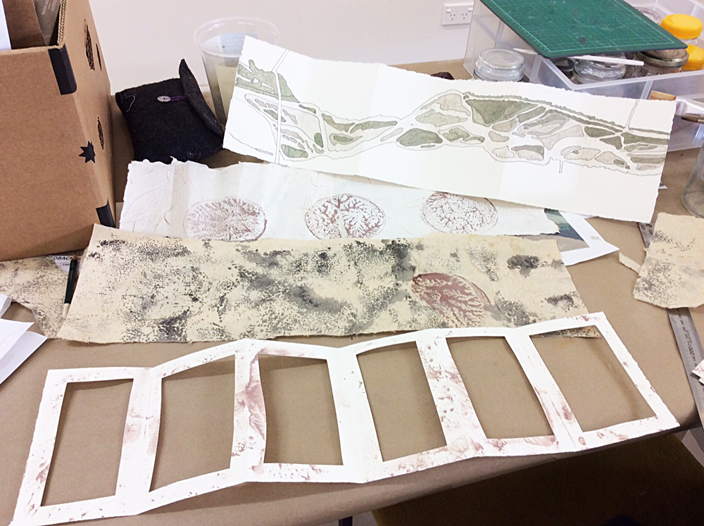
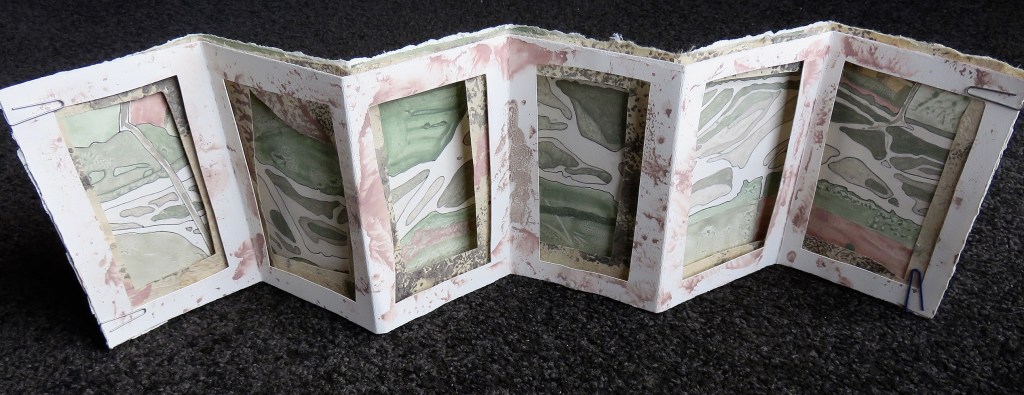
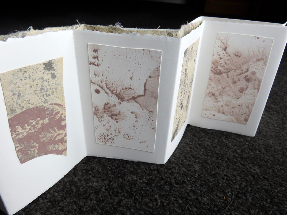
*Muller imprints are made with the tool that is used to grind the pigment powder into the binder. The suction created by lifting the muller off the paint creates the patterns on the muller base that I then imprint on to paper. I have made two layered concertina booklets using the pigments and the braided river as inspiration. Not finished yet! A couple of other books using print and paint are also in progress.
More to come later.
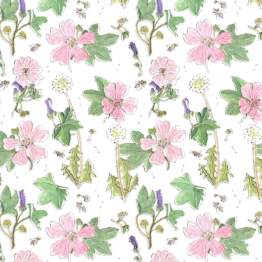
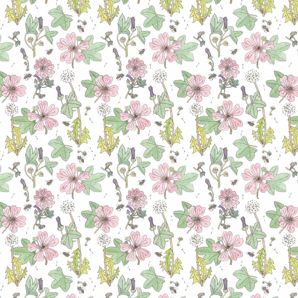
Repeat Patterns
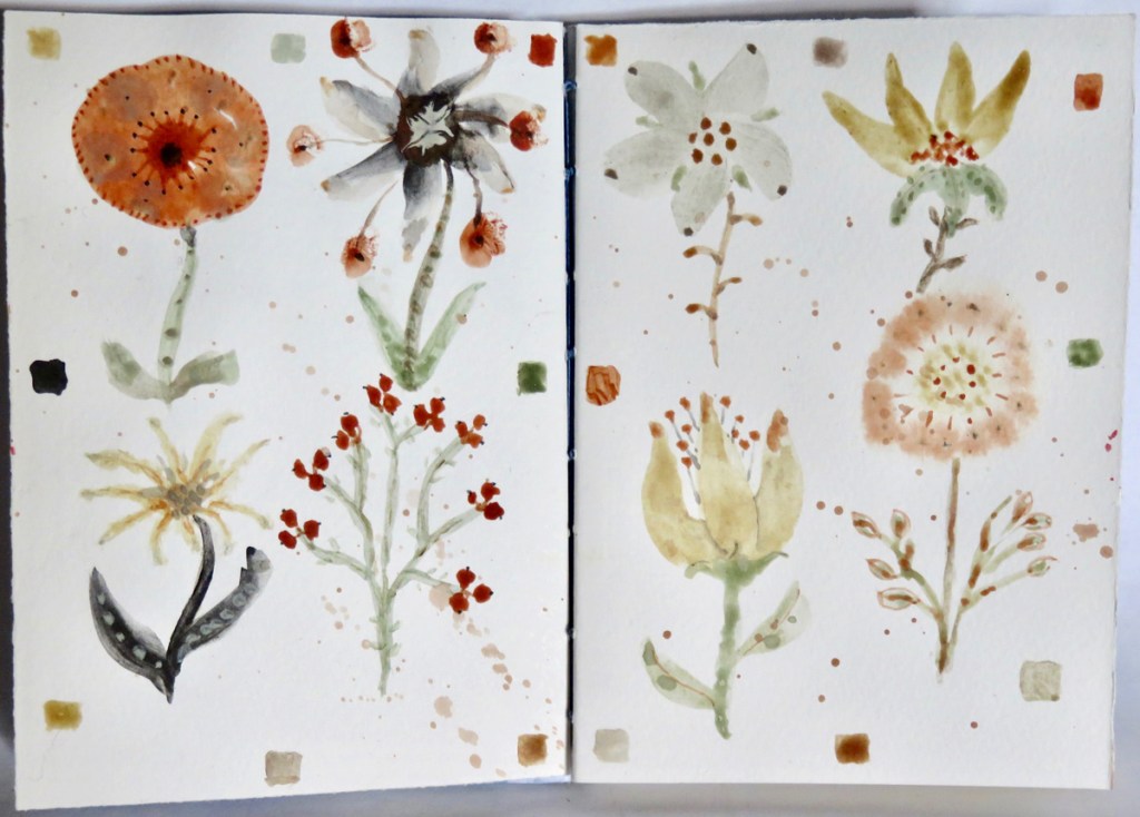
Autumn now in the garden; mallow flowers still calling the bees, and dandelion clocks lingering in the grass.
Two patterns, one off-register. This was accidentally the result of painting in watercolours a sheet of tracing paper laid over the ink outline pattern. I married the two scans together in Photoshop to create this first image. The second image is the pattern created from painting an A4 version of a print of the outline tile.
Really enjoyed this, feel I am getting somewhere now with this process. Thanks to pandemic lockdown I have had the time… As we say in New Zealand, “Kia Kaha” – Be Strong. And take care.
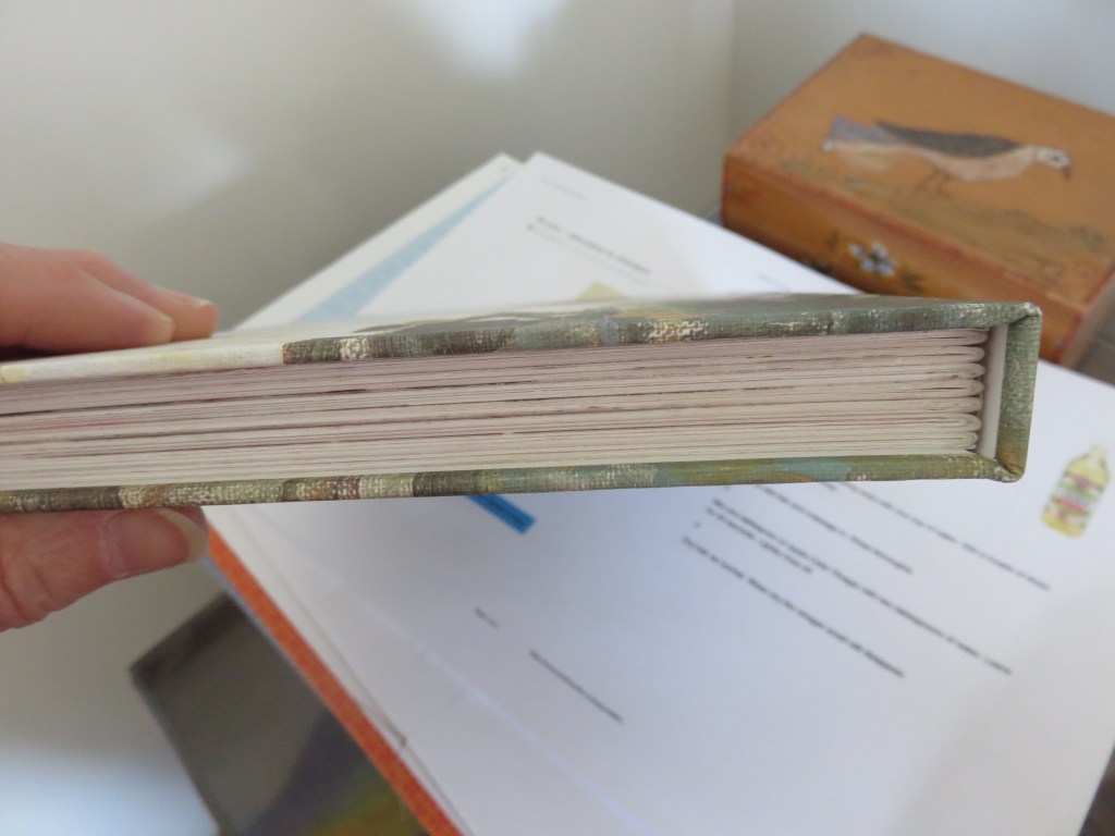
Have had a flurry of making prints to bind into books. These books are the result of making folios with painted paper and paper printed by two gelatine printing plates, one bought and one home made.
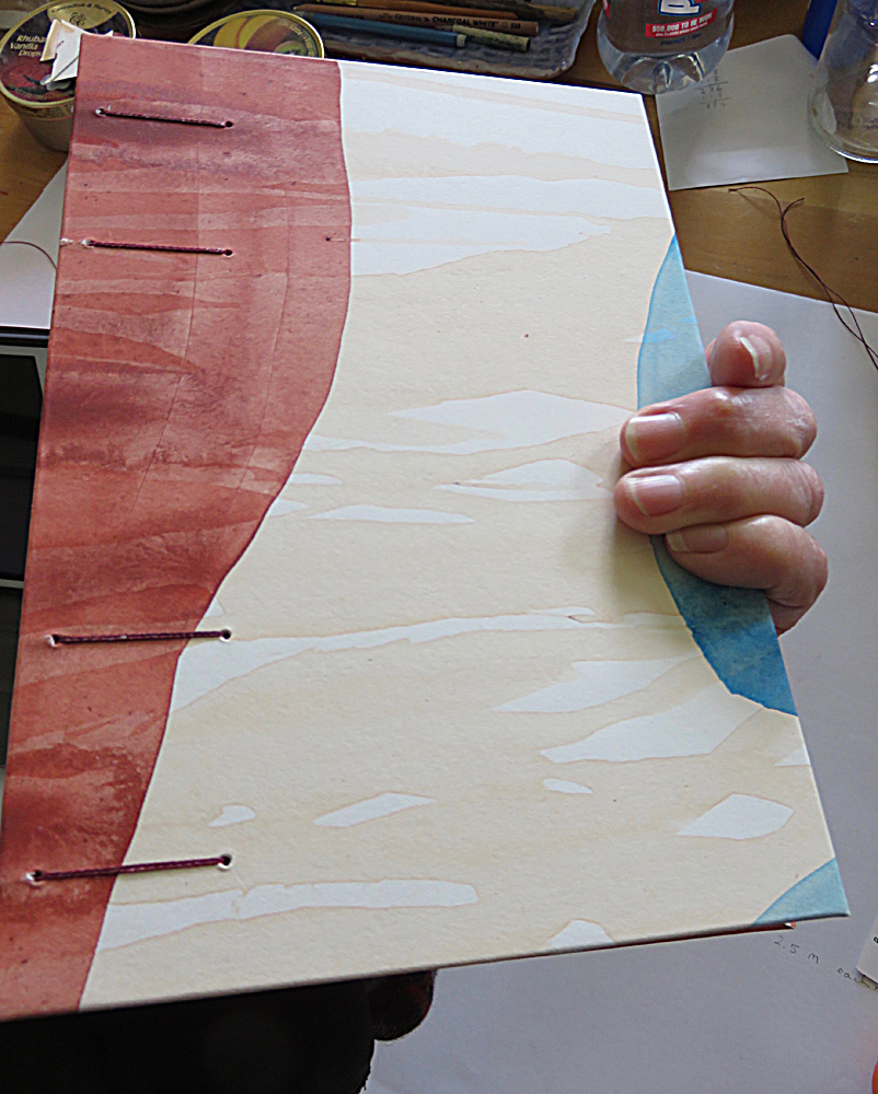
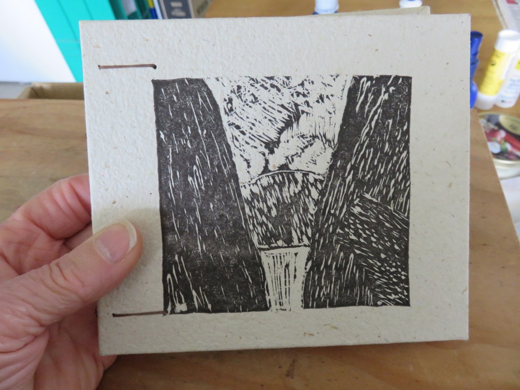
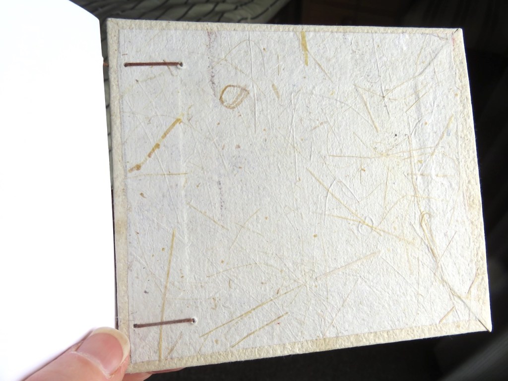
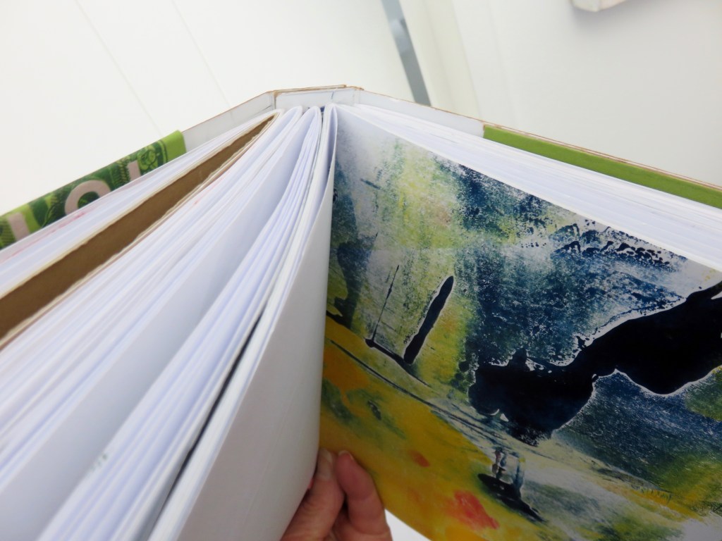
This is the latest effort; a book covered with acrylic paint on thick hot press paper (600 gsm or 360 gsm? Painted years ago). The binding is 4-needle coptic – my first one.
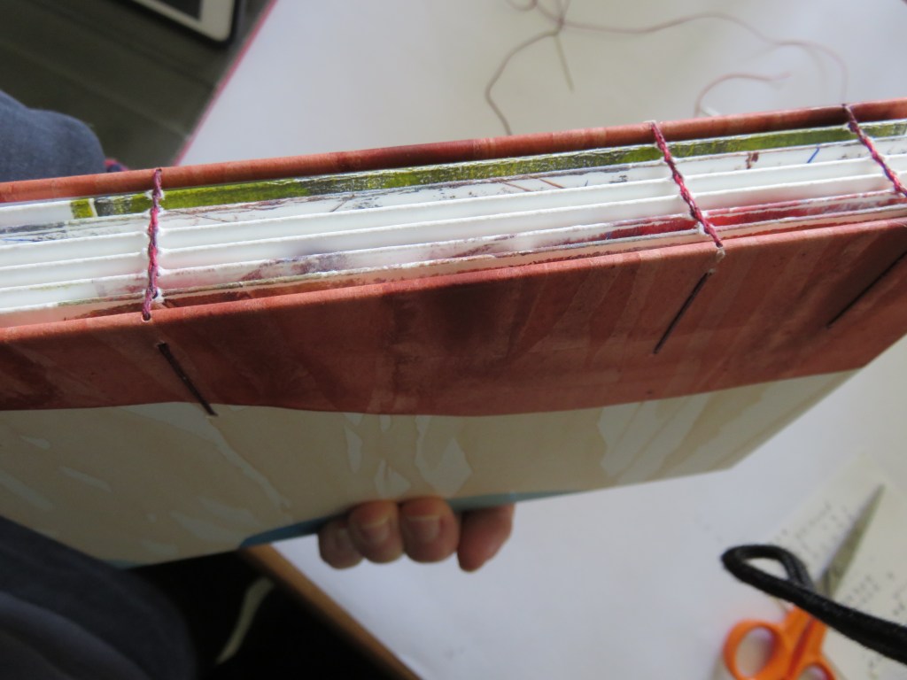
The book above has a 2-needle coptic binding. I’m following a video course – at the stage I’m at with bookbinding I sometimes find books hard to follow, and find being able to see what I am trying to do very helpful! The internet is such a wonderful resource.

This is a small concertina book. The cover is old wallpaper from my parent’s house in Auckland. Just love being able to use these odd bits and pieces left over and kept for decades. I thought the butterflies appropriate companions to the flowers, and had great fun using that trick of applying paint alongside a fold and then pressing the two sides together. I tried to be as quick and free as I could to outline the images in pen. I made a mistake though with the last one, as you can see, it wasn’t in the fold… but at least I had the opportunity to create another viewpoint.
These are all books I have made following the Handmade Book Club.
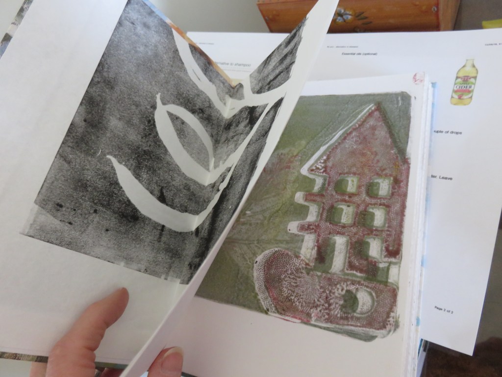
This is a case book that I made as well. In Oxford we have our own bookbinder – which is so great – and I learnt how to make these books from her a while ago. The first image below was created with a collagraph print suggested by the ‘fossil’ rock I have shown in a previous post.
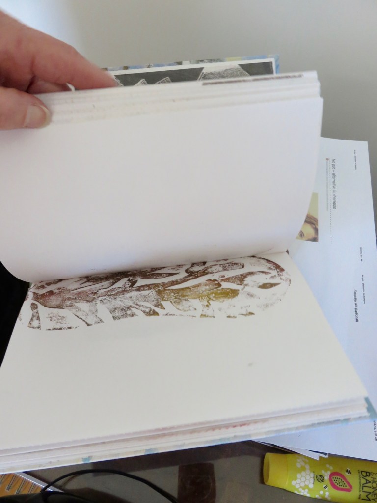
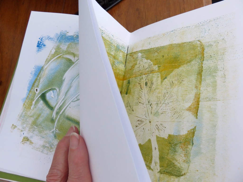
Many of the prints are from gel plates such as the one below. The end paper is an embossed print formed by a piece of harakeke (New Zealand flax plant).
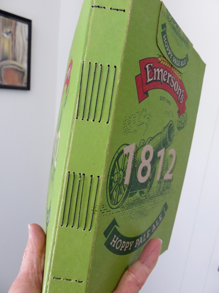
This is my’ recycled’ book – made from a beer carton, ghost prints, left over printing ink or paint transferred to sheets of paper, and a cotton scrap from an old shirt to reinforce the spine for the exposed stitch binding – just in case. I consulted Alisa Golden’s book “Making Handmade Books” for this technique.

These books are destined to be diaries or journals or sketchbooks. Really happy to have found a use for my collection of paintings and prints.
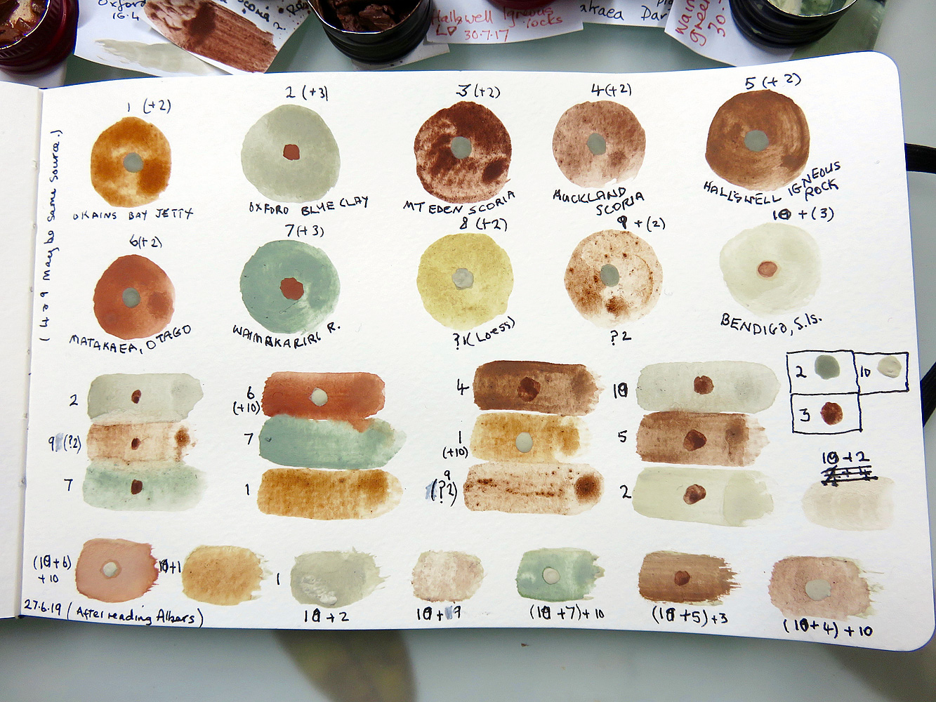
Seeing how colours change when applied to different background colours. Had been reading at Joseph Albers’ Interaction of Color. I understand why he used coloured paper – no brush marks etc!
