Canterbury Pigments

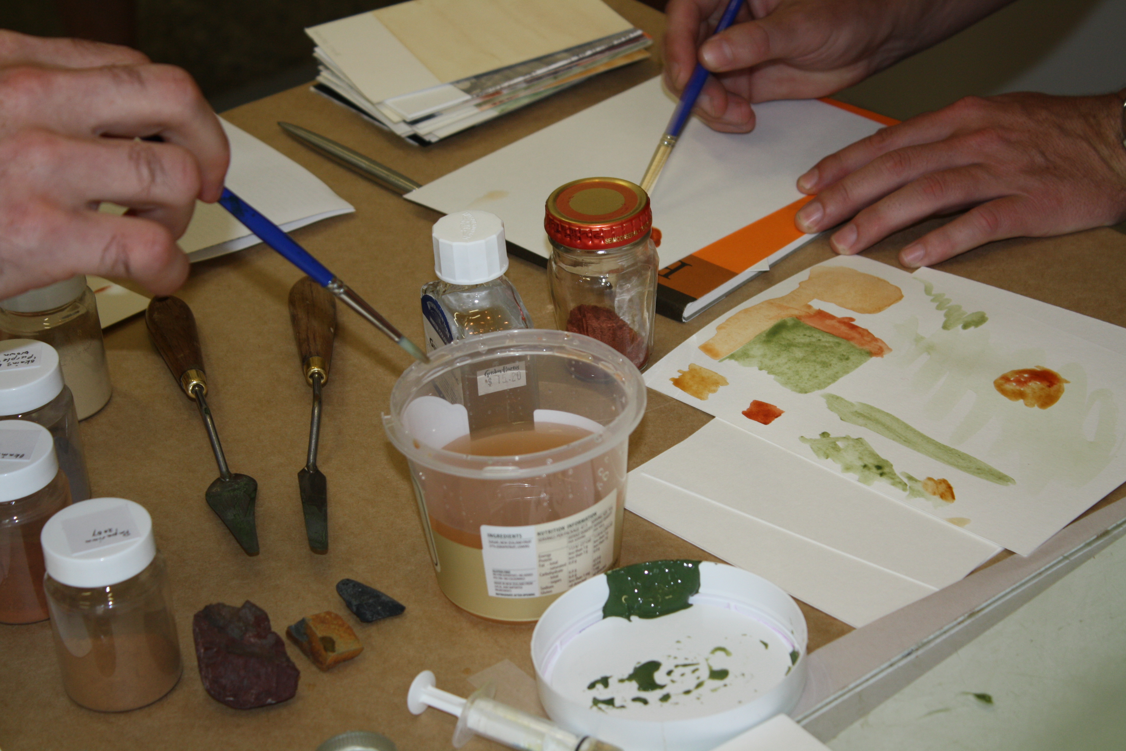
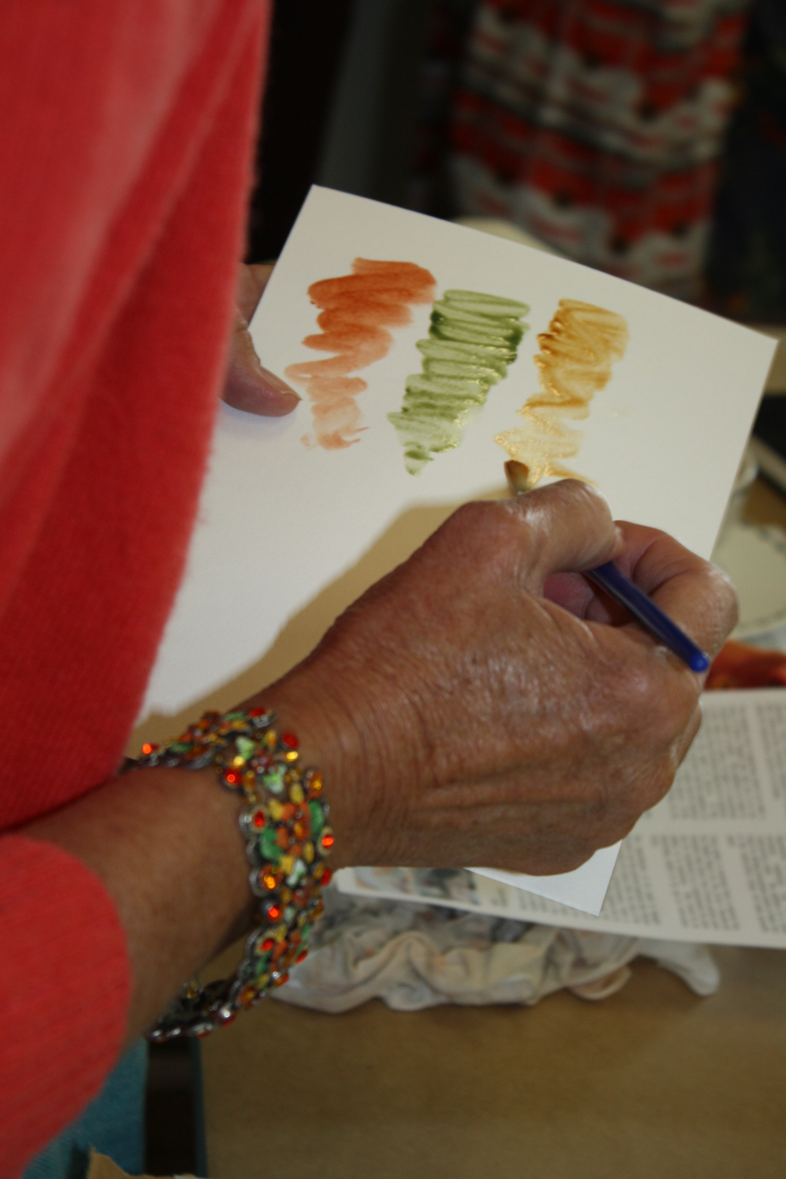
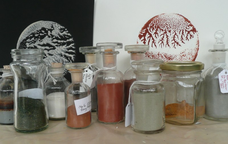
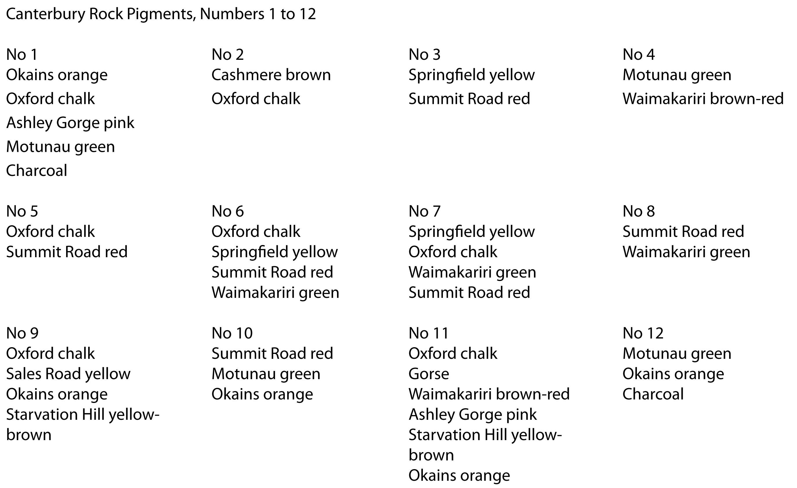
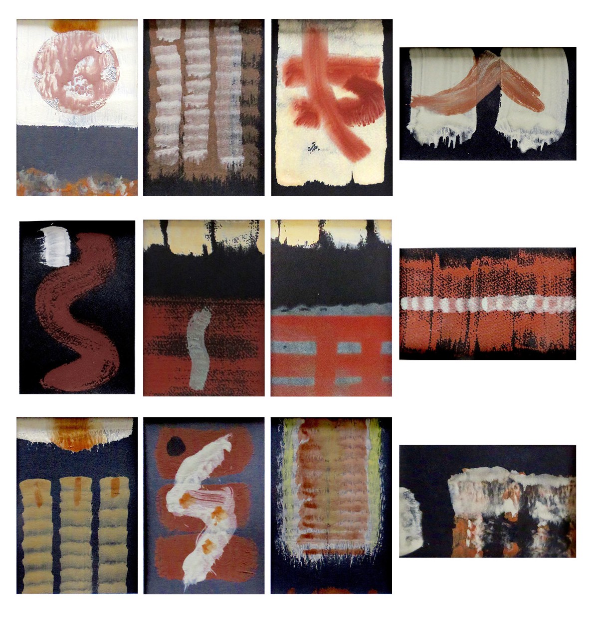
I’ve been working with my pigment rock collection lately.  Re-testing and recording to replace the work I did in Textbook 2 which was lost (i.e., stolen…).  The rocks and earths of the Canterbury Plains produce these colours that are presently on show in “View and Do” at the Arts in Oxford gallery.  All the artists taking part in the exhibition are holding workshops.  The workshops are varied – watercolour painting, abstract design, ceramics, box making and paint making.  Volcanic and sedimentary rocks, chalk and lime are gathered here to make twelve separate watercolour paintings, all 50 x 95 mm on black paper.  Details of the location of the pigments in each painting are  listed below.  The details are in the same order as the paintings:

Canterbury Rock Pigments web

view and Do Portrait

Green dye from Black Turtle Bean

Following on from the previous post about black bean dye –

The next day, bicarbonate of soda was added to the Black Turtle Bean solar dye.  Colour changed to green and this colour transferred to the un-mordanted silk and cotton scraps.

This test needs to be redone; the bicarb was added to the original dye which was probably a bit tired – the beans were ‘going off’ at the time.


Black-turtle-bean-green-1


I also added to the solar dye pot some rolled-up paper, but the green disappeared into a brown-green when applied to paper.   Something in the paper which is photocopy paper reacting with this dye.  Where the pools of dye were deeper the green colour is just apparent.  This paper is stuck onto the test page and covered the swatches in the above image, hence the change of page direction!

Green-turtle-bean-on-paper


Leaf Prints from Glentui Valley

I am starting out on a printmaking journey. I have a new press, new inks and new paper, so lots of experimentation and not a lot of resolved or finished work just yet. I do enjoy the discovery of new ideas and methods. I have been been printing with two good friends, Ruth Stanton McLeod, printmaker and Sue Alexander, jeweller and printmaker, for about two years now, but it is quite daunting doing it all by yourself!

So, to encourage my artist into action, I thought I would post a few prints for scrutiny by the wider world – a sort of critique session.

I had an ‘artist’s date’ in September when I visited Glentui Valley to walk a Department of Conservation bush track, with the idea that if fallen leaves presented themselves to me during the walk I could collect them up and take prints – eco prints on paper or nature prints perhaps.

The  leaves in the nature print below are three finely veined makomako or wineberry leaves (Aristotelia serrata), a small fern and a whauwhaupaku (five-finger Pseudopanax arboreus) with only three leaflets, it had lost the other two.  I like the way the plant juice pressed out from the whau has contributed to the print – even providing its signature.  The print was made with water-based ink, and if I had used oil-based ink I could have coloured the leaves with my watercolour paints.  The paper was dry Tiepolo, 290 gsm, the ink was Flint.  I have also just started to print on a ‘premium digital ink jet’ paper, 100 gsm, which is acid free but not sure if that alone gives it art archival status.  With oil- and water-based ink you get a really nice print on the smooth ink jet paper, and it dries well.  Good for tests!

Glentui-leaves
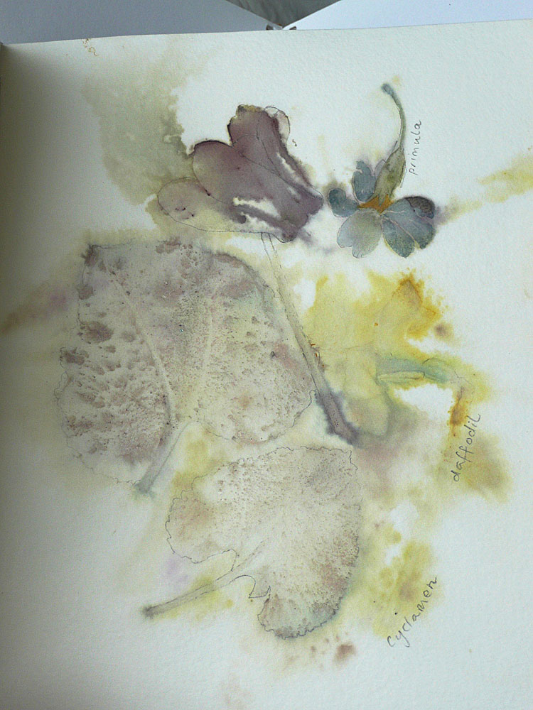
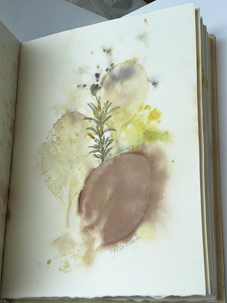
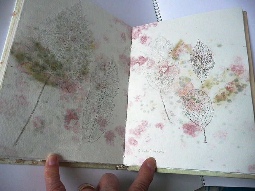
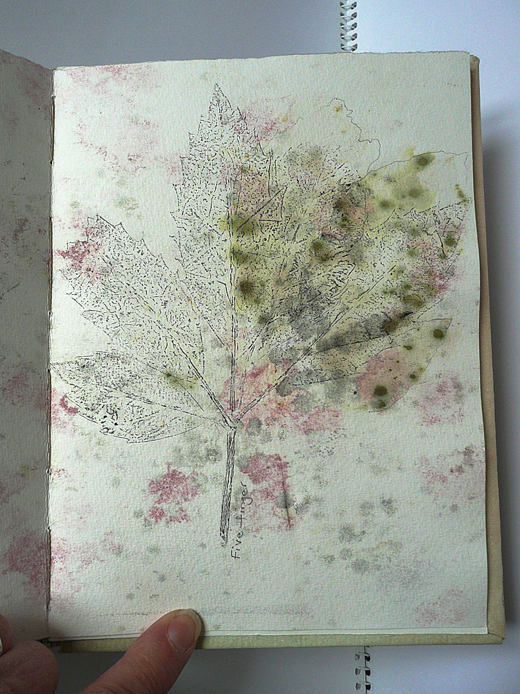
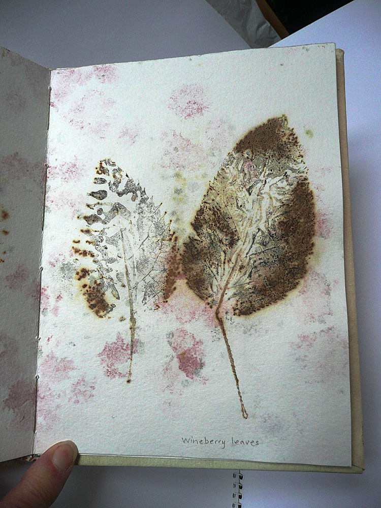
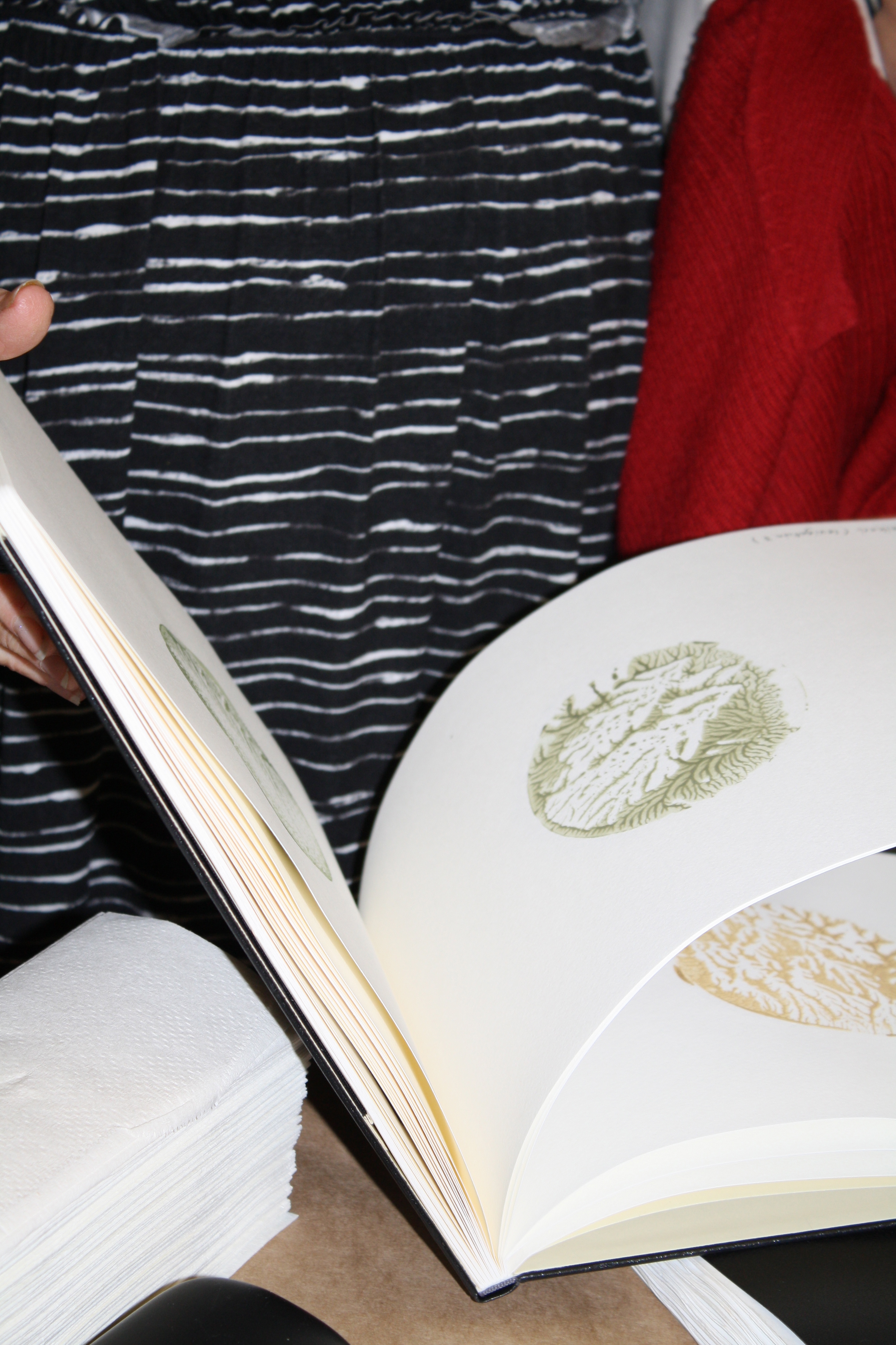
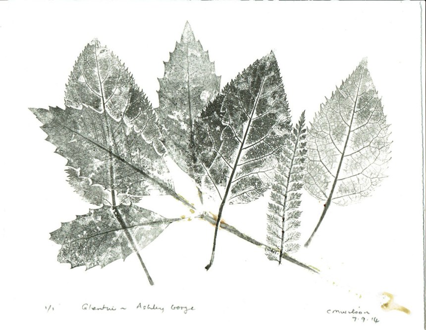
I also used the leaves collected at Glentui for a paper steam – some images needed further work.  I added in colourful plants from the garden,  to take advantage of the spring flowers.

Eventually, these images were made into a book which I have just completed.  The book’s cover is paper from a much earlier nature printing session when leaf prints were applied onto a sheet of paper coloured by earth pigments (Waikari green and an oxide brown-red watercolour).  The nature prints in the book were made using oil-based ink, and were added on top of the steamed ecoprints.

As an experiment for this book, I applied the Waikari green paint to the black beech leaves, a Winsor & Newton blue watercolour to the primula flower petals and above them a touch of Indian Yellow, and pencil outlines were used to define some other leaves and flowers.  However, the pink and grey marks on some of the sheets of paper occurred as I left the damp paper between plastic for a few days…  Mould, ie!  There is also a lot of colour transfer from the plants themselves through to the adjacent pages of the stack as it was being steamed.

The last page shown here, of two wineberry leaves, is a steam of leaves I had previously used in a nature print – hence the black impressions appearing within the colours of the leaves.

A good way to record a walk and the progress in using my new etching press!


Cover

Cover-black-beech Cover-cyclamen Cover-griselinia Cover-print-leaves Cover-whau Cover-wineberry


Colours from a Landscape

I am currently showing some pigment colour swatches at the Dunedin Botanic Gardens, and in October I am doing a workshop on making paint.   This exhibition was facilitated through the Blue Oyster Gallery in Dunedin.  Also included in the show are some natural pigments on paper – eco prints – and some raw pigment.  The two artworks on paper show colours from Waikari (green)  and Ashley Gorge (pink and green)  in North Canterbury.  Many thanks to Clare Fraser from the Dunedin Botanic Gardens who is in charge of the venue.  I think the colours look fantastic presented on black paper against the lovely red walls of the Information Centre!

The pigment swatches each show a colour found at a specific location which is named on the swatch.

Image

Appearing below are some of the photos I received from Jaime Hanton, Blue Oyster Gallery, Dunedin, who kindly photographed the show and installed the work for me :

Dunedin Botanics 1

Dunedin Botanics 2

Dunedin botanics 3

Dunedin Botantics 4

This is not my anticipated installation for this show as the initial selection was stolen.  My box was left on the pavement by the courier company and disappeared overnight.  The items in this box were some of those in the photograph shown in the display case, bottom left corner.  If, by any chance, they turn up, I would just love to have them back.  They represent five years research, experiment and recording.  I have given up hope of ever seeing them again, however, and will re-build as much of the information as I can…  Worse things happen, and I ‘count my blessings’.


P1160373


Dunedin Botanics 6

Shells were traditionally used for paint containers!

Paint making workshop at the Papakura Art Gallery, Auckland

Image

During the current exhibitions Colour of Distance and What’s on Your Plate at the Papakura Art Gallery, I had the marvellous opportunity to hold a workshop on paint making from locally found pigments.  Three different colours were made during the workshop, and I brought many colour swatches made from Canterbury mineral and organic pigments for attendees to see and touch.

In the photo above, the What’s on Your Plate artwork just to the right and behind me on the wall, caught my attention because it shows a tin can label that lists many of the items that are produced from by-products of the petroleum industry.  I read through them all, hoping to see ‘pigments’ listed – but it wasn’t  –  probably round the back of the can!  One of the reasons that started my interest in making paint was that so many colours are derived from oil.

Image

Image

Image

Image

Image

Image

Many thanks to Tracey Williams and Kate Hart of the gallery for the use of these photos taken during the workshop.

Colour of Distance is the latest group show by Cristina Silaghi, Helga Goran, Jocelyn Mills, Kim Lowe and myself, and it closes on the 7th April.

For more information and photos of these two exhibitions at the gallery,  visit their Facebook page via this link:  Papakura Art Gallery .

Okains Brown

I’m pleased to say that my paint making is getting better – not that there was a problem, but the paint was shrinking quite a lot as it dried.  Not surprising really as this is what clay does when it dries out.  I am an artist, not a chemist, so it is a trial and error process, especially as every pigment reacts differently.  I can now say that my half-pans of paint look more like the ‘real’ (commercial) thing.

I wrote an essay on locally found pigments for my last year at university.  I was motivated in this research because I feel we take artists’ paint for granted!  I just accepted that these colours come out of a tube or a pot, without a second thought of their origins.  Then I realised, these paints are made overseas from materials themselves imported from other places, and I became curious about what pigments might be found in New Zealand.

A painting’s main constituent – paint – and how paintings are physically made is not usually considered in art history or art theory but, of course, to a painter the paint, consciously and subconsciously, is of prime importance, as it is central to the act of painting.  The painting material itself also provides the artwork with context, subject matter, psychological content and visual stimulation.  I feel it is an overlooked component.  A painting’s material presence is often overlooked, partly because we are so used to viewing images in print or on the screen.  There is much on the subject of paint for conservation practices, and advice about art materials and techniques on the internet and in manuals, but a conversation on the ‘material memories’ (James Elkins, What Painting Is: How to Think About Oil Painting, Using the Language of Alchemy, 1999) contained in and shown by the paint or the act of painting is not usually considered.

If a painting, both in its subject matter and in its materials, is regarded as a repository of history, current circumstances – economic, environmental and ethical – encourage me to investigate the possibilities of using locally found pigments as an alternative or companion to commercial, imported pigments and paints.  The experimental use of these pigments will provide information as to how such material itself performs, in most cases unlike commercial paint which offers (thankfully!) large quantities of paint of uniform consistency and pigment distribution.  My use of relatively unrefined pigments has produced some exciting effects.

I find that locally found pigments each have an intrinsic or essential character.  The wish to explore and exploit these idiosyncratic qualities, specific qualities and problems, is perhaps seeking to return to individuality or a rejection of bland uniformity.  I started to experiment with ocherous and clay based paint in order to research the different optical effects (for example, chroma intensity or gloss or matt surfaces) and handling properties of paints, and to maximize the granulation and flocculation effects of some pigments in water-based mediums.

I also experiment with plant based paint.  The same granulation effect occurred (though with much finer particles).  Here, for example, the colour extracted by water from the empty seed cases of Phormium tenax – Harakeke or the New Zealand flax plant.  The texture and colour of this dry paint varied, and in places where the paint pooled, the dark areas of colour produced a sheen on the surface of the dry paint.  (This P. tenax liquid contains no added substances and should probably be called a toner.)  Also, the paint dispersed and dried differently from commercial paint by showing varied pigment dispersal and paint body per batch of paint.  The artwork thereby inadvertently and indirectly reveals a new aspect of the plant and, in the artwork, the plant has a new lease of life.

Phormium tenax – Harakeke, organic pigment (toner), paper, 76 x 56 cm, 2008. In private collection.

And, if you got through all that  –  have a great painting day!

Nascent paint manufacture!

I usually make my paint and straightaway use it to make a painting.  I’ve been making watercolour paint to sell, but it’s not as easy as you would think!  The moisture in the paint evaporates, of course, but shrinks and leaves cracks as it does so.  I see from Studio Art Supplies (Auckland) that the Schmincke company takes ages to complete the process of filling pans of paint, letting the layers dry before adding another.

Watercolour paint is great, it is revivable after going dry and solid – you can use every last little scrap of it.  That’s good as it takes a while to grind the pigment down to powder and then use the muller to incorporate the pigment into the gum arabic vehicle. Another exciting thing about making paint is the way the finished paint colour suddenly appears whilst you are making it and the pigment becomes fully dispersed in the vehicle.

The various colours definitely have a psychological effect!  I find browns boring, the crystal-clear glauconite green beautiful, and the reds elating.  I just wish I could find a good blue, but as we all know from art history, its an elusive (and therefore expensive) hue.

I’ll keep battling on, trying to understand how the different pigments dry, and hopefully have a few half pans ready.  Thanks for the photos, Andrew!

Image

Image

Natural pigments for an art practice

My (current) interest circles around the earth and organic pigments of the North Canterbury region of the South Island of New Zealand.

Copyright © Celia Wilson 2021. All rights reserved, may not be reproduced without prior permission except for reference or educational use.